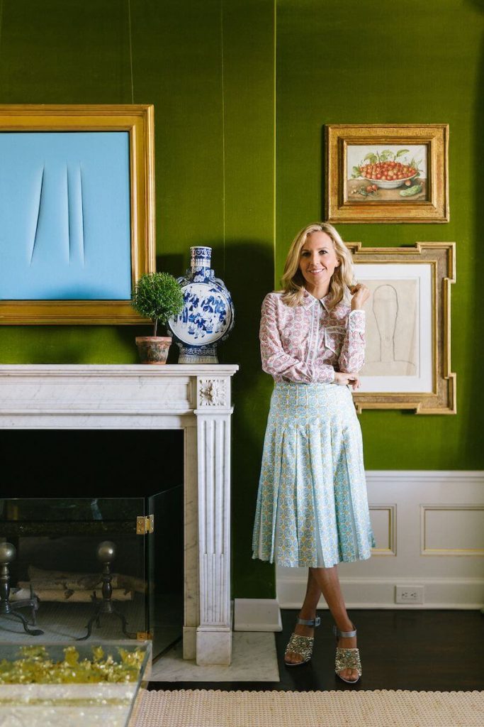
(Cover photo of Tory Burch on her green sofa by Richie Shazam for Interview Magazine)
Happy Saint Patrick’s Day!
Now, I am not Irish. In fact, I don’t know that I’m personally well acquainted with anyone from the Emerald Isle. But I do live in Seattle, the Emerald City! Green is all around us here–at least when we head outside.
Indoors? Not so much. Seattle, like much of the West Coast, has been a peddler of the white, modern interior.
Such a shame, given Seattle’s history. Green interiors were a signature of the Craftsman style that has come to characterize this city. Alas, we will need to look elsewhere if we wish to see a current, green interior design scheme.
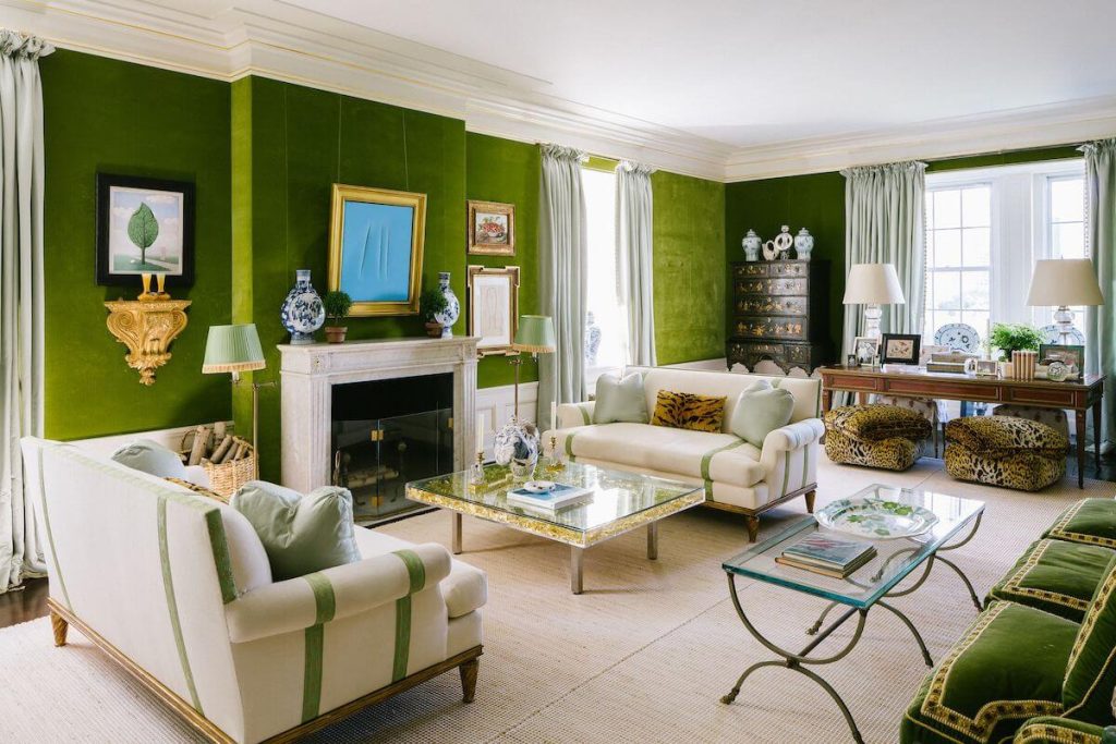
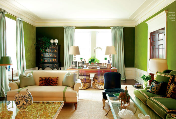
One of the most famous green rooms in the last 15 years is the one created by architect and designer Daniel Romauldez for Tory Burch. This room has made the rounds of the shelter press and blogs, of course, but it’s so well-executed that it is worth revisiting.
Burch is well-known for her eponymous mid-range fashion brand. She is also known as one of the few true society mavens of the modern era, carrying the torch for previous such forerunners as Babe Paley or Gloria Guinness.
Let’s explore Burch’s green room by starting first with its architecture.
This room was designed with classical proportions. If you look at the dado, you will notice that it is appropriately sized for the room. Using the furniture in the room for reference, we can deduce the dado rail is installed at 28-29” above the floor. It looks like the ceiling here could be roughly between 8 or 9 feet high, though I am inferring the latter.
Many people today are not well-acquainted with classical architecture, and so we get silly rules like the 1/3 guideline for “chair rail” installation, where one is to divide the vertical wall measurement into thirds and that number will determine the height of the rail. This is incorrect for a number of reasons, not least of which is the fact that a dado is not meant to serve as a buffer for furniture hitting the wall!
But that’s a topic for another time. Suffice to say that for Burch’s sitting room, the architectural proportions are spot on.
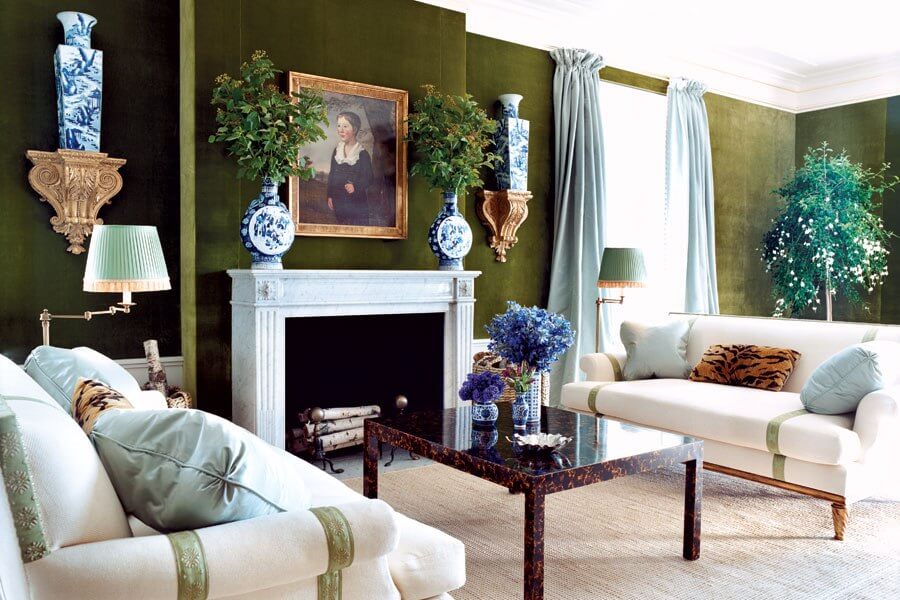
The most noticeable aspect of the room is the green velvet wall covering, which lends the space a sumptuous and casual charm. If you look closely, you will see that the treatment is beautifully executed with a clean-edge finish. There is no trim or welting used to hide the fabric edges. This is accomplished with a track system by which the edges of fabric are carefully tucked behind specialized furring strips attached to the wall.
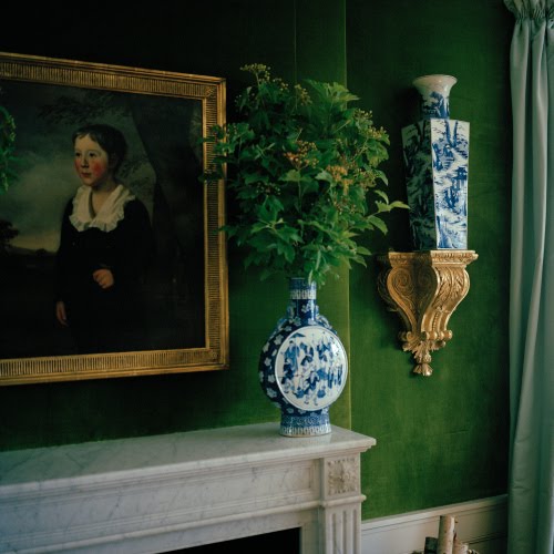
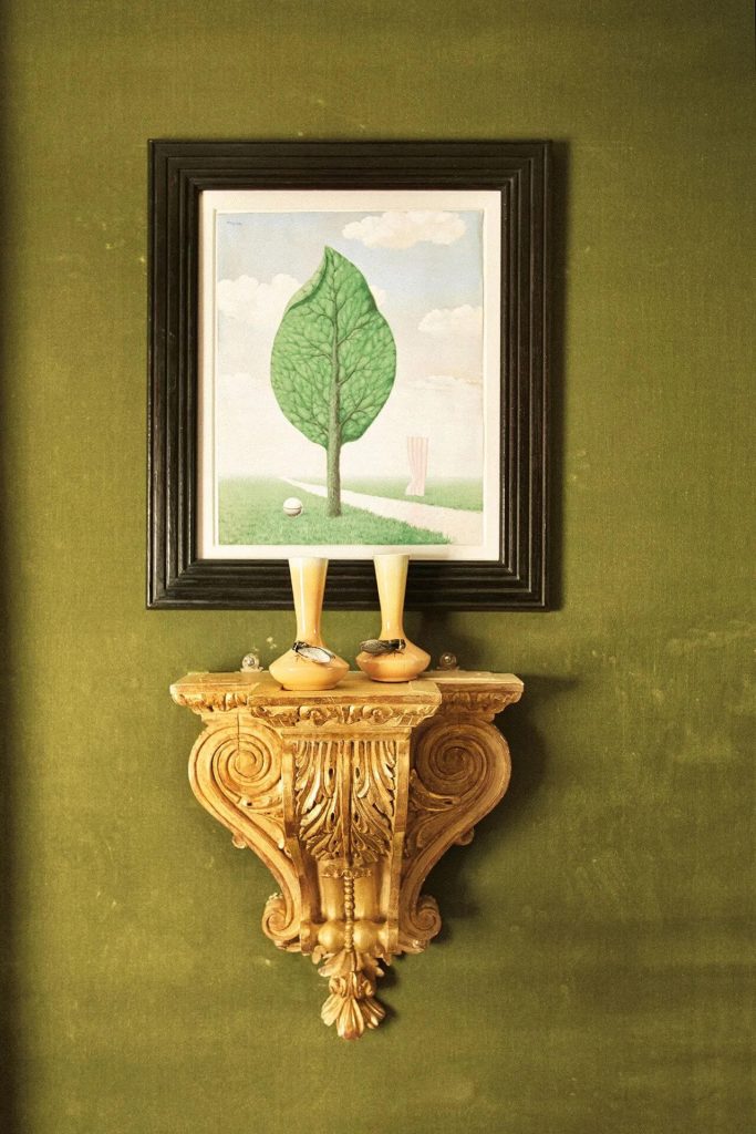
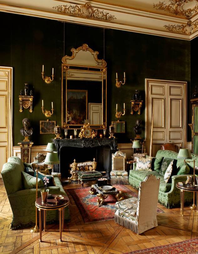
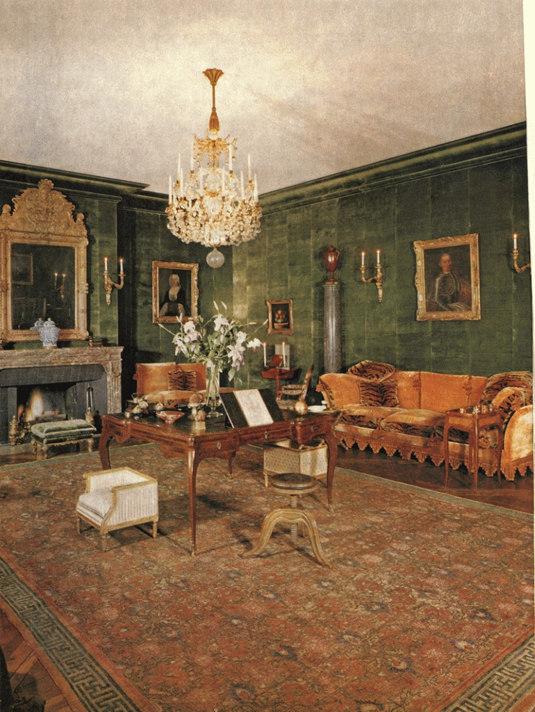
Those familiar with the history of interiors will instantly recognize an affinity to the grand salon implemented by Georges Geoffroy at 42 Avenue Foch in Paris for Guillaume and Dale de Bonchamps. Here, Geoffroy dressed the room from floor to ceiling in a cypress green Prelle velvet, including on the moldings.
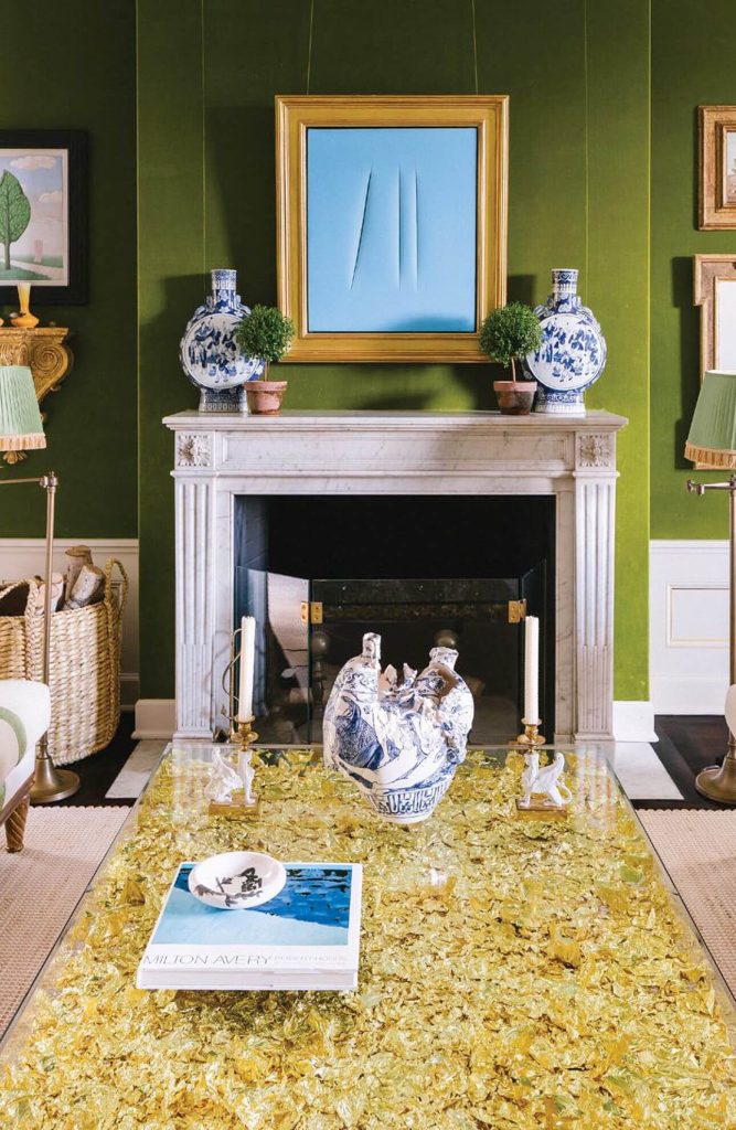
However, the moldings in Burch’s room are white with gold-leaf accents. This is an homage to another famous green room which we will touch on further below.
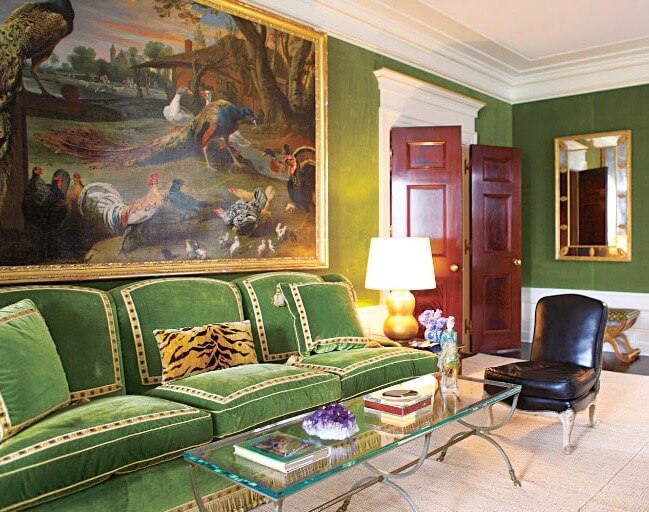
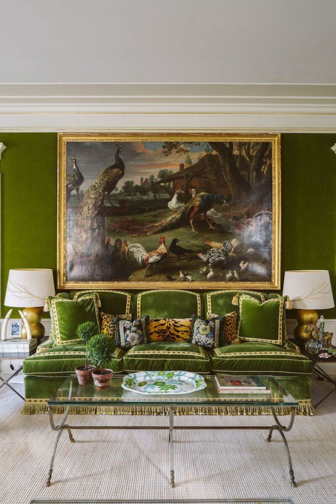
The wall opposite the fireplace features a green velvet sofa behind a glass Maison Jansen-like coffee table. Louis XV slipper chairs upholstered in leather flank the table. The sofa cushions feature frames of flat trim and contrasting welt. The sofa frame is skirted in a tassel fringe.
The sofa is particularly interesting because it an almost exact replica of the one that belonged to Hubert de Givenchy at his Hôtel d’Orrouer residence (Speaking of which, Christie’s will be auctioning off some of Givenchy’s furniture and art collection in June). The Hôtel d’Orrouer also featured a salon upholstered in green velvet.
Burch has stated before that Hubert de Givenchy reminded her of her own father. Givenchy’s “salon vert” was almost certainly the basis for Romualdez’s design for Burch’s sitting room.
Above the sofa hangs an oversized 17th-century Dutch painting of birds by Melchior d’Hondecoeter. I love the play of scale here; it is a masterful design technique. Using select oversized pieces in smaller rooms with lower ceilings actually makes such rooms feel larger.
Tory Burch’s green room is a wonderful example of a classical design language interpreted for a present-day lifestyle. The room is casual and comfortable, but still high in style and visual impact.
