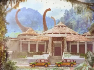
My last post was an introduction to the design of the Jurassic Park Visitor Center’s exterior. I touched on the architectural style of the building, and the elements which referred back to that style. I also touched on the meanings behind some of those elements as they relate to the story of Jurassic Park.
Before proceeding, a disclaimer: Be advised that this blog post includes images of copyrighted material for the purposes of providing commentary and criticism on a small portion of a larger work. As such, this post constitutes a transformative work protected under fair use doctrine as stated in Title 17, Chapter 1, Section 107 of the United States Code as implemented by Congress beginning with the Copyright Act of 1976.
Now, let’s cross the threshold and head indoors to explore the design of the Visitor Center’s interior!

The Rotunda

The film largely takes place outdoors, with only a handful of scenes set inside buildings: the field trailer, outhouse, bunker, maintenance shed, and, most importantly, the Visitor Center.
In particular, the Visitor Center holds great significance to the film’s narrative. As we have discussed, its exterior showcases a post-modern design, which seamlessly continues into the interior.
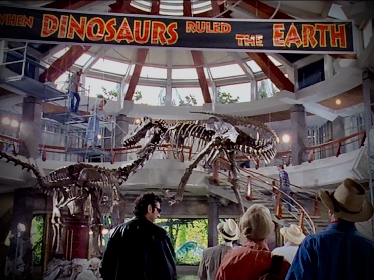
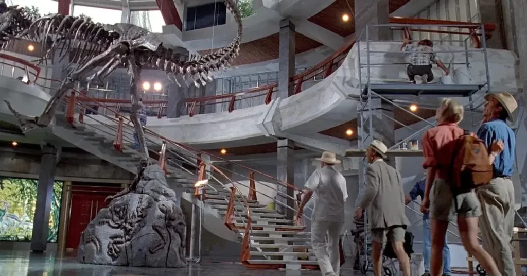
As we step through the imposing double doors, we are immediately filled with awe. A lofty rotunda greets us, adorned with articulated skeletons portraying a Tyrannosaurus rex attacking an Alamosaurus.
These skeletons serve as powerful reminders of the remarkable technological advancements achieved in cloning and resurrecting these extinct creatures. While Grant and Sattler marvel at such progress, they also feel a sense of melancholy, as they ponder the potential “extinction” of their own paleontological careers.
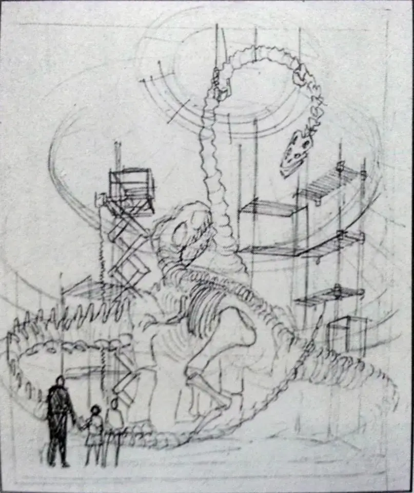
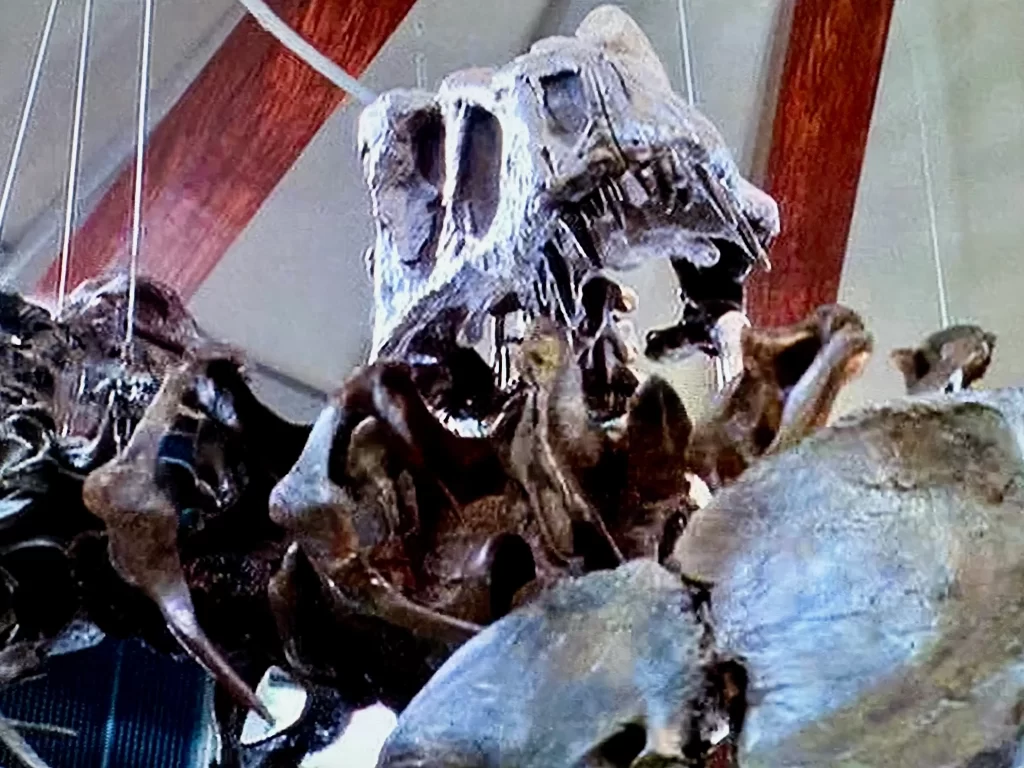
The skeletons seen in the film were created by Canadian company Research Casting International, which creates fossil replicas for museums and other institutions.
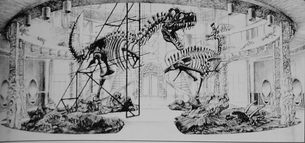
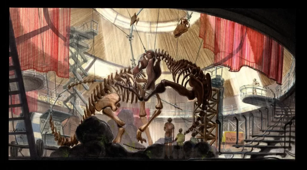
The Rotunda’s Design
The rotunda itself is a feature borrowed from classical design–perhaps the most famous rotunda being the Pantheon of Rome. Classical design elements are often used for institutional buildings to convey gravitas and grandeur.
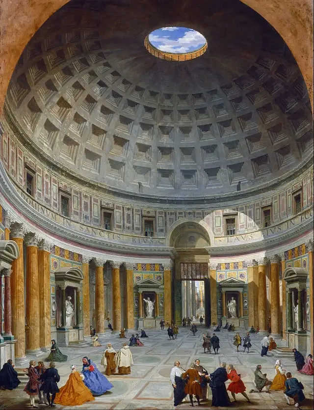
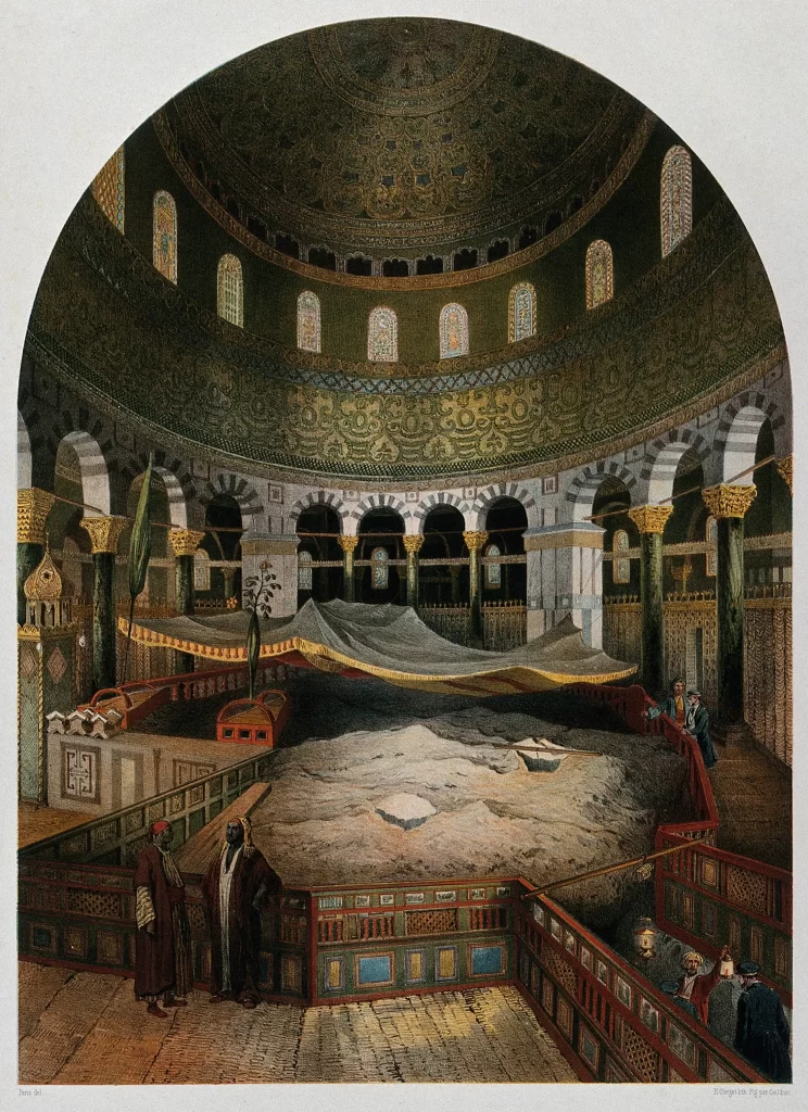
The interior of the Visitor Center was actually inspired by the interior of the Dome of the Rock in Israel, per production designer Rick Carter.
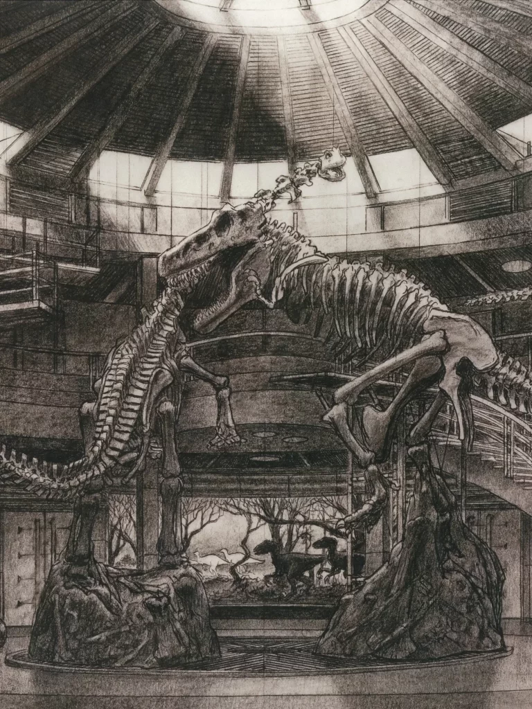
Unfinished Business
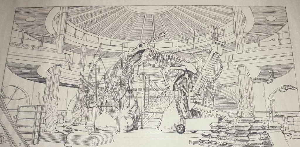
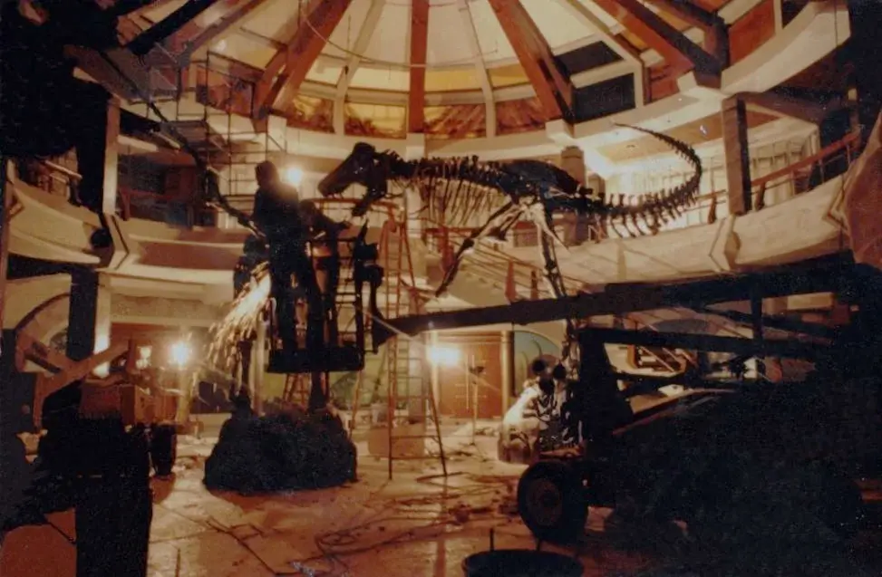
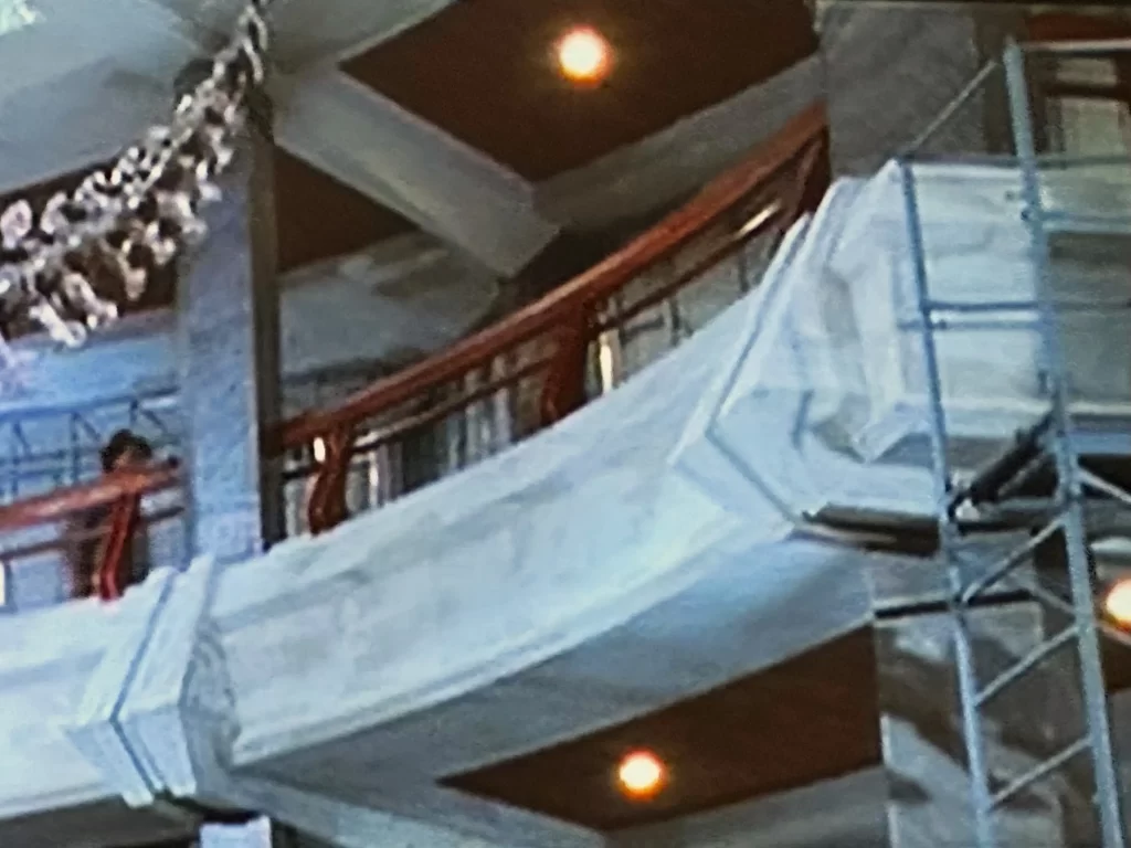
Walking into the Visitor’s Center, it becomes immediately apparent to us that the place is unfinished. Scaffolding, plastic tarps, wire bundles, and workers can be seen both inside and outside the building, adding to the sense of incompleteness.
This state of incompleteness is important to the story. We must remember that Hammond has invited experts to the island to appease anxious investors and their lawyers who have been alarmed by recent accidents at the park. They won’t allow Hammond to open the park to the public unless he can get the endorsements of credible experts who can attest to the park’s safety. The building’s condition serves to remind us that despite the wondrous sights we encounter, there are still many issues to be resolved.
Unearthing The Architectural Materials
As our gaze moves upwards, our attention is drawn to ceilings adorned with reeding, mirroring the appearance of the thatched roofs outside.
Complementing this design are the wooden stair and mezzanine guardrails, which infuse a sense of warmth into an otherwise austere environment dominated by metal, concrete, and stone. These “living” wood elements contribute to creating a more inviting atmosphere within the space, which makes sense. After all, we are in a theme park.
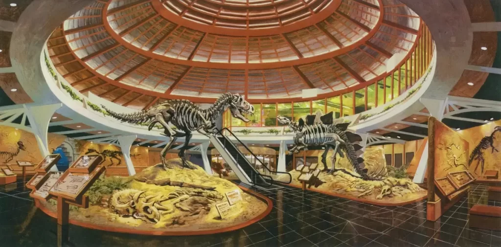
Interestingly, early concepts for the interior of the Visitor Center did not show a staircase at all, but an escalator. Perhaps this was seen as very tech-forward in the early 1990s, but it calls to mind shopping malls and airports. Not very compelling, if you ask me. I’m glad that the production designers ultimately settled on a staircase.
Heart of Stone
The majority of the space consists of metal, concrete, and stone–all very hard elements, both physically and visually. Each of these materials tells a different story.
Precious Metal
Metal, in the form of iron and steel, is a modern construction material which arose in the 19th century and revolutionized the way we build. It provides strong support while maintaining a sleek profile. In the Visitor Center, it is used as an accent that signifies “progress” and “innovation.”
Concrete Blocks
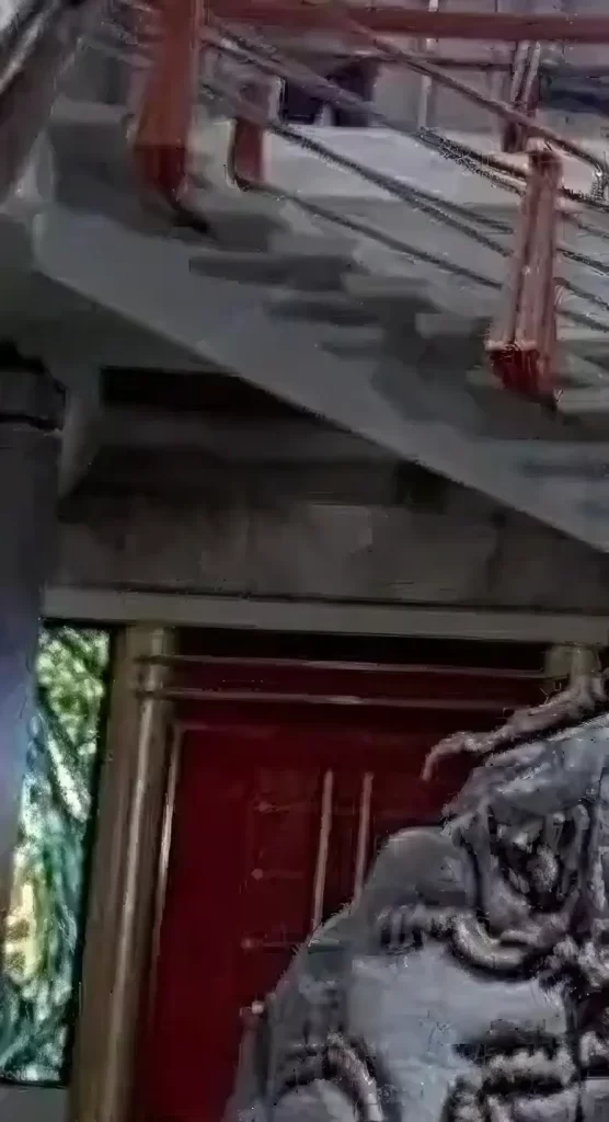
Concrete signifies fortification and is also extensively used in modern design. Like the exterior, much of the Visitor Center’s interior structure is made up of raw concrete.
Despite Hammond’s frequent claim of sparing no expense, concrete serves as a relatively affordable building material. It enables fortification at a lower cost. In the film, it symbolizes “modernism” and “control.”
Stone Age
Finally we have stone which, along with wood, is the most classical of all building materials. Although not as prevalent as concrete in the interior design of the Visitor Center, we do see stone being used in strategic areas. The use of stone here harkens back to venerable architectural traditions and also alludes to the ancient fossils (which are really just bone turned to stone) which hitherto have been all we have known of the mysterious dinosaurs.
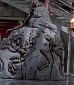
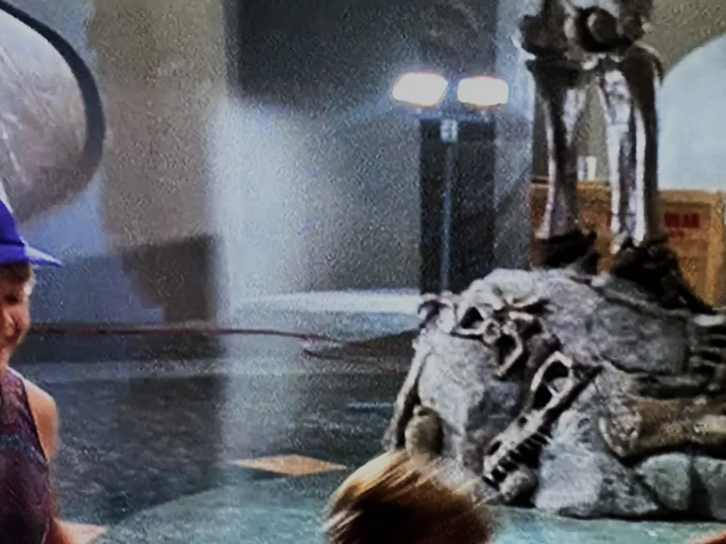
Most importantly, we see stone plinths supporting the articulated skeletons. These appear as raw stone, with only some relief carvings to give the impression of fossils locked in matrix.
We then see granite used for the columns around the perimeter of the room. These support the mezzanine and extend upward to support the conical roof. The arrangement of the columns mimics arrangements in classical architecture. The ground floor columns nearest to the building entrance are also carved at the base with a fossil and matrix pattern in homage to classical pedestals.
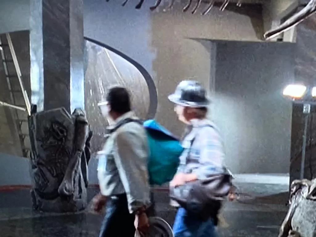
The floors of the rotunda are stone, as well, but we never get a good enough look at them to be able to distinguish the material. They appear to be marble, but could also be terrazzo (which is just a bunch of crushed stone particles poured together with binder). When we do get a brief look, we see that they are inset with a pattern of different colors—green, pink, grey, black—arranged in a circular design.
When Dinosaurs Ruled the Earth
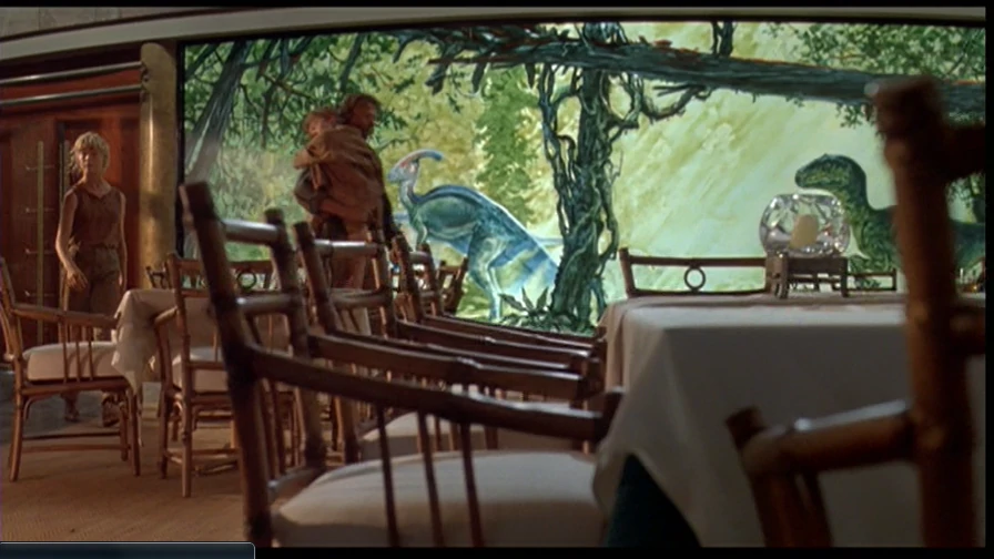
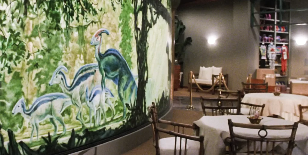
As we gaze past the skeletons on the ground floor, a long mural catches our attention. The mural is flanked by pairs of wooden doors on both sides, guiding us into the Cretaceous Café beyond. It is one of the few moments of color in the space, which is otherwise dominated by shades of grey.

Artist Douglas Henderson created the murals, showcasing dinosaur species as they appear in “real life” at Jurassic Park. Many people overlook the two smaller murals alongside the central mural with Velociraptor and Parasaurolophus: one featuring Gallimimus and the other showcasing Brachiosaurus.
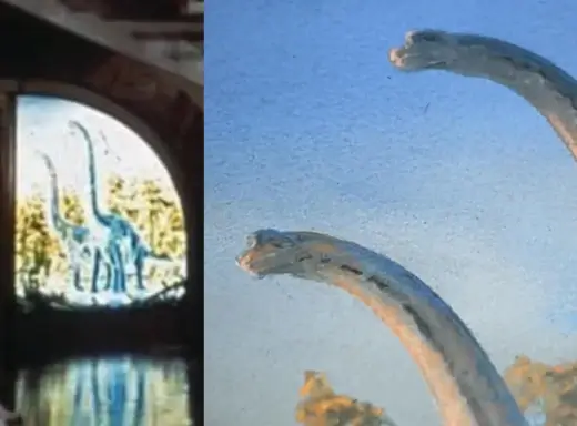
The murals are composed of 10 plexiglass panels. The panels were 8 feet tall, with the central mural being just over 15 feet wide.
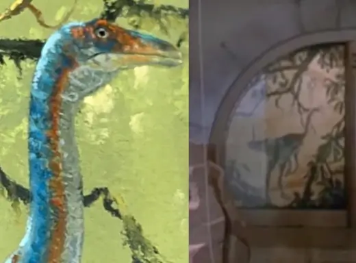
The mural resembles a pill sliced lengthwise, reflecting postmodernism’s preference for curved shapes. A border made of stud-shaped stones or tiles surrounds the mural.
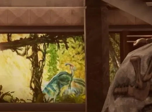
The mural aims to evoke the era “When Dinosaurs Ruled the Earth,” as emphasized by a prominent banner hanging over the rotunda. However, it’s important to note that in reality, none of the depicted species historically coexisted or inhabited the same location, except at Jurassic Park.
Dino-Bites
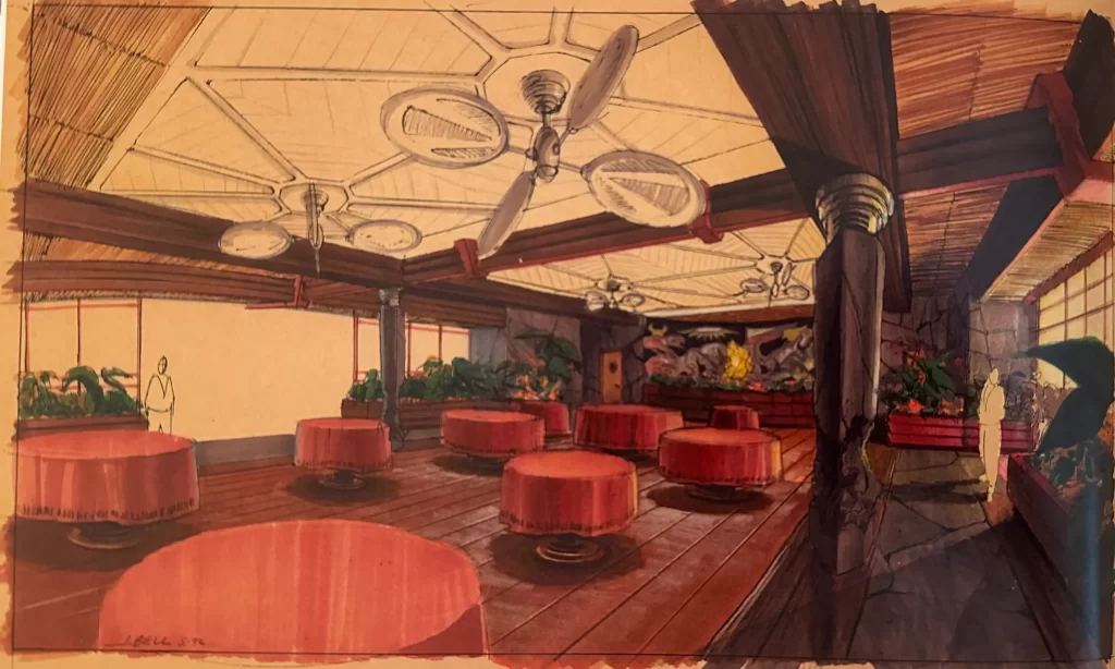
Walking beyond the pairs of wooden double doors that flank the dinosaur mural will lead us into the Jurassic Park dining area, also called the “Cretaceous Café.” This is an expansive room where many important scenes take place in the film.
An early concept for this space by artist John Bell shows a long, low-ceilinged room with wooden beams, rock work, and interior planters filled with exotic plants. Large tropical ceiling fans hang overhead. This concept appears to be inspired by Hawaiian interior design of the 1940s and ’50s. It reminds me a bit of the old decor of the Kilauea and Volcano House lodges on the Big Island of Hawaii.
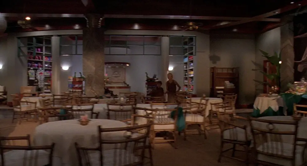
The design of the dining room in the final film doesn’t stray too far from John Bell’s concept. For example, it keeps the granite column we see in the concept image.
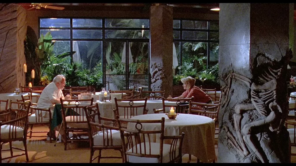
Here, we notice the granite columns with fossil bas reliefs, several clothed tables, a rock work wall, and jungle plants. Towards the rear of the image, we see a glass curtain wall and doors which lead to a landscaped tropical terrace beyond. The floors here appear to be covered in a golden broadloom carpet, either wool or sisal (though the latter would not work for high traffic public areas as this room is intended to be). However, in other areas we see grey terrazzo or river stone pathways.
Some tables have layered tablecloths: white over hunter green—very 90s. Many tables also have glass and brass hurricanes, in keeping with the tropical theme. All of the tables are surrounded by lovely bamboo cane chairs.
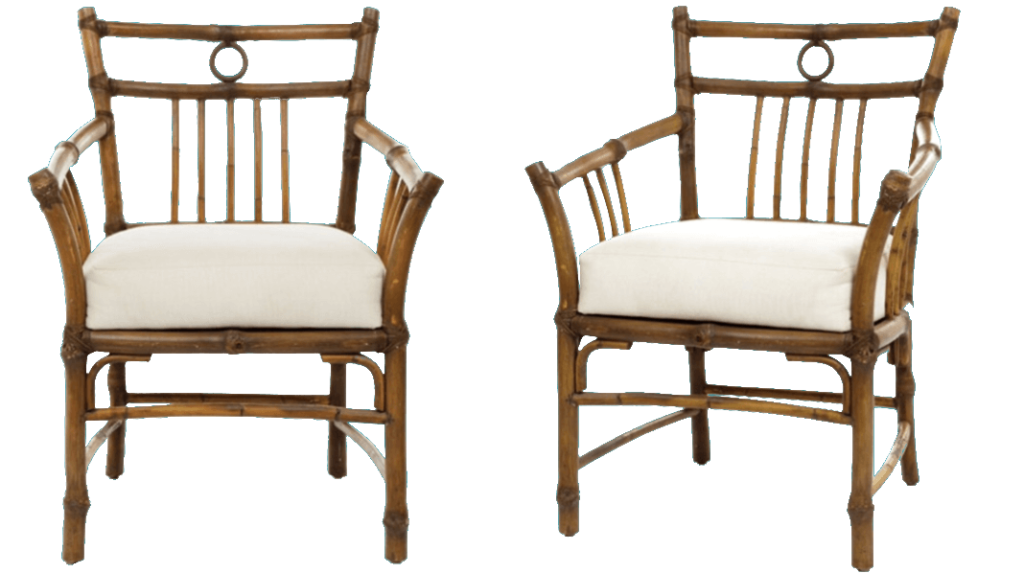
I’m not exactly sure where these chairs came from, but they look very similar to what we might see from the famed rattan furniture company McGuire (formerly out of San Francisco).
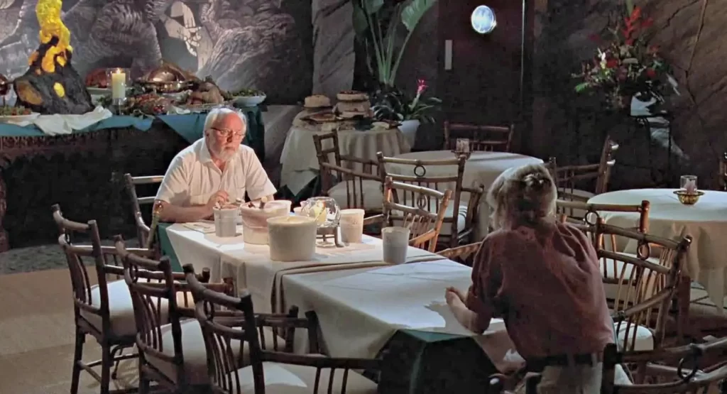
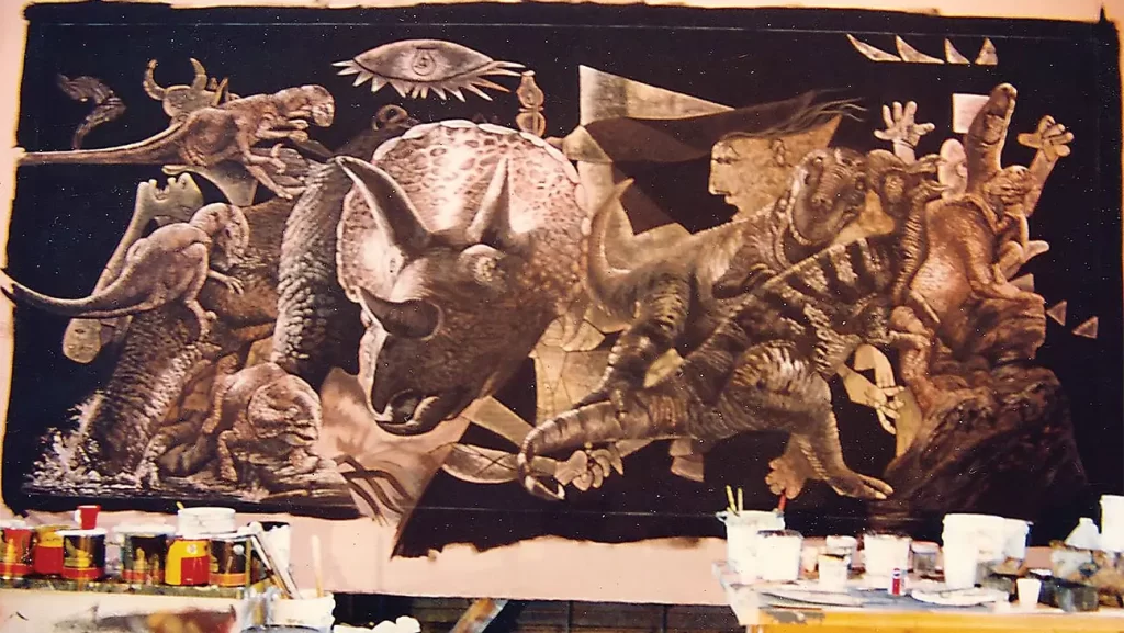
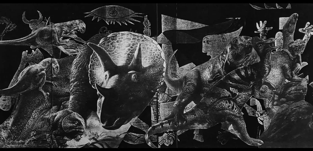
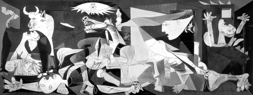
The back wall of the dining room features a large, monochrome mural of stylized dinosaurs. This was actually a mural designed by scenic artist Michael Denering especially for the film, inspired by Picasso’s 1937 anti-war masterpiece, “Guernica.” However, it’s not clear how exactly the message of the original painting translates to this reptilian interpretation.
Exit Through the Gift Shop
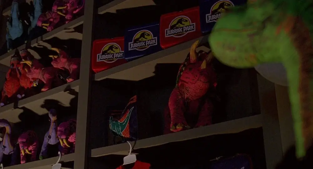
No theme park experience would be complete without a gift shop, and Jurassic Park is no exception! You gotta sell the merch!
The Gallimimus Gift Shop sells a variety of Jurassic Park-branded merchandise. It is designed in the prevailing postmodern style of the rest of the Visitor Center, with a slightly convex, open facade. The store is delineated from the rest of the dining space by rounded columns and open trellis work in early ’90s turquoise.
The side walls feature built-in shelving, and there is a circular checkout counter, above which hangs a relief plaque showing the Jurassic Park logo in a sandy stone. The colors here are muted taupe-y grey. There are some hemispherical sconces for accent lighting, but most of the space is lit by recessed lighting as in the rest of the building.
The gift shop actually looks much different in the film than in the original concept art, which had DNA helices emerging out of a giant piece of amber in the center of a round room that looks like a miniature Jurassic Park rotunda.
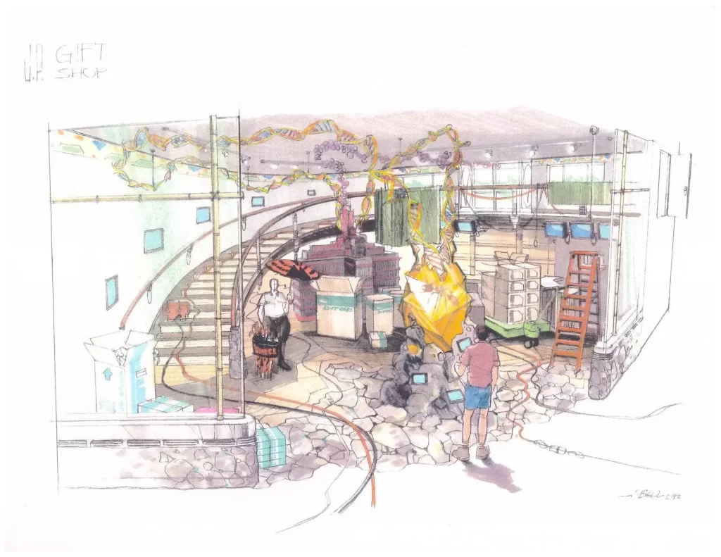
The Kitchen
The kitchen is accessed through side doors situated on either side of the back wall. When facing the back wall, we would see that the door to our left has a handle, whereas on the other end of the wall the right door to seems like a push swing door.
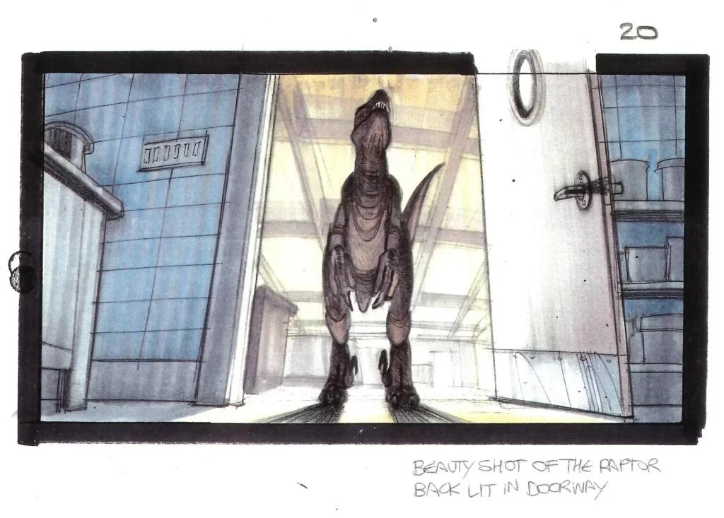
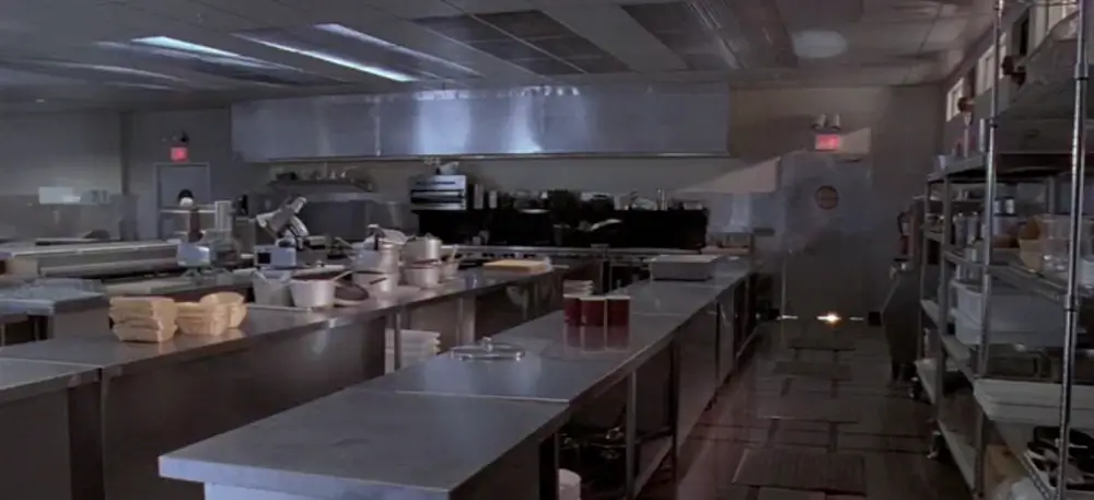
The scene in which velociraptors stalk the children in the kitchen is one of the most noteworthy in the film. However, the design of the kitchen itself is not especially noteworthy.
Steven Spielberg wanted an industrial kitchen, inspired by the one seen at the hotel in the Kubrick film “The Shining.” He specified to production designer Rick Carter that the surfaces in the space be brushed stainless steel. The kitchen intentionally looks much like the commercial kitchens one would expect to find in any hotel or resort.
Wonders Never Cease
The interior of the Jurassic Park Visitor Center inspires a sense of grandeur and awe. The architectural marvel skillfully blends futuristic design elements with subtle allusions to the past, evoking a profound appreciation for progress and innovation. Through seamless integration of cutting-edge design (for its time) and captivating displays, the visitor center invites us to embark on a thrilling journey through time and fully embrace the wonders of both architecture and science.
Stay tuned for the next post at the end of “Jurassic June” as we go into the belly of the beast to explore further interior designs of the Jurassic Park Visitor Center in honor of the film’s 30th anniversary!

