
Choosing a color palette is an important step towards creating a cohesive interior design. Your palette will guide your choices in paint colors, textiles, accessories, and artwork. In fact, a good color palette is the bedrock of a strong design concept.
However, I find that a lot of people have difficulties with choosing colors. As a result, they can play it too safe and stick to whites and beiges, or they go too far with their color choices. Believe me, I have seen some very lurid color combinations!
When it comes to choosing a color palette, an understanding of color theory can be helpful, but is not necessary. After all, color theory is simply a model for color combinations, and is just one of a number of such models out there.
Instead, one of the easiest and most pain-free ways to choose a good color palette is to look to nature.
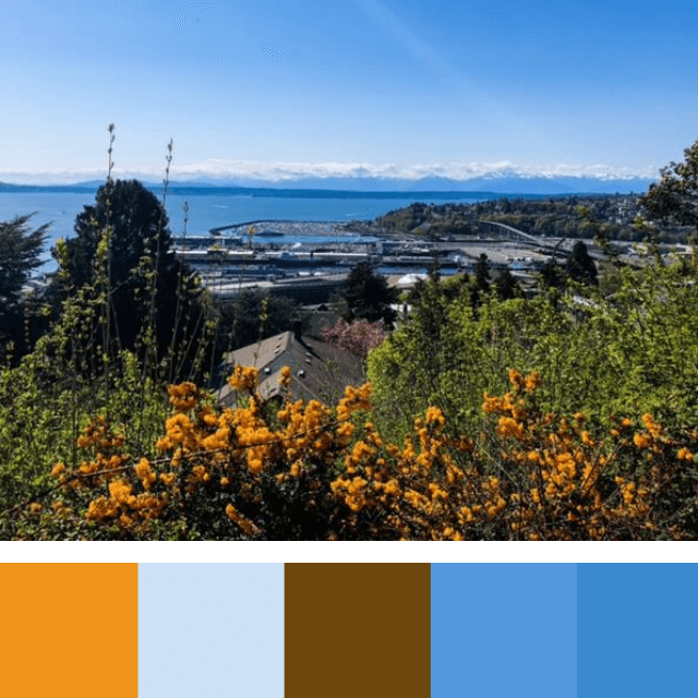
Here in the Pacific Northwest, we are spoiled with a munificence of nature right at our doorstep. Just step outside and take note of the colors you see and how they are combined!
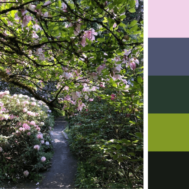
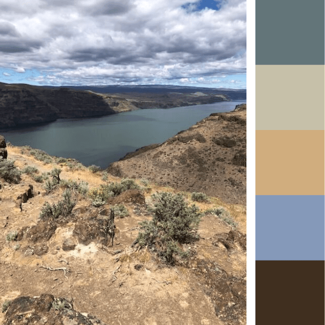
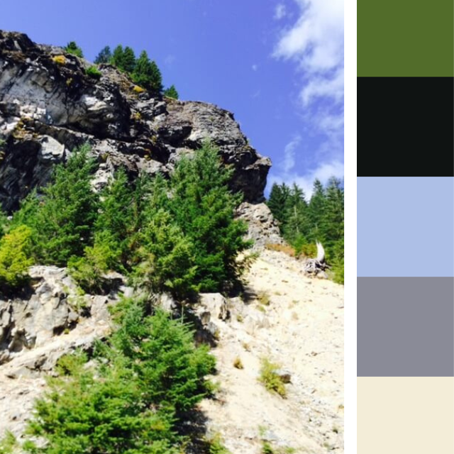
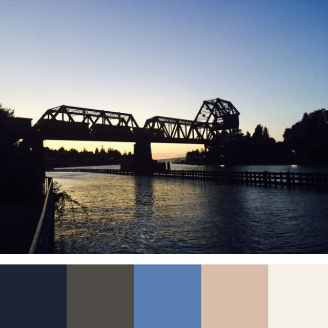
Taken from Nature
Below, I have developed six color palettes based on landscapes I have seen in and around Seattle:
Applying Nature’s Lessons
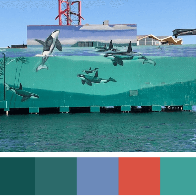
This mural above by artist Robert Wyland exemplifies the natural beauty of the Pacific Northwest. Painted with the help of rock legend Eddie Vedder, the mural depicts a pod of the famous Southern Resident orcas swimming in the turquoise waters of Puget Sound. Located on the side of the Edgewater Hotel on the Seattle waterfront, the artwork is almost a natural extension of the real blue-green water below. A splash of red from the Edgewater sign is the manufactured cherry on top this synthesis of the natural and manmade.
Here, Wyland used the colors of the Salish Sea to create a naturalistic work of art. Yet one could do the same to create a cohesive, conceptual interior. As you can see below, I have created a Salish Sea interior concept using the color palette from above.

Mother Knows Best
Clearly, Mother Nature is the best at choosing the right color pairings. Rarely, if ever, does she get her color combinations wrong!
If you find yourself in a rut trying to create a color story for your interior, or even to choose paint colors for an exterior, you can always turn to nature for a little inspiration!