
Valentine’s Day is just around the corner and it has me seeing red–red interiors, that is!
The color has long been connected with the holiday due to its countless associations with, well, love. Red is the color of blood, which is what the heart pumps through our bodies and makes our cheeks blush. It is also associated with other emotions, such as passion, anger, and power.
For these reasons, red can be a temperamental color. Perhaps this is why we so rarely see it used in interior design anymore. In a modern society that favors the safe and unobjectionable, red can be too emotionally and culturally charged.
That’s a shame, as it is such a seductive hue. After all, isn’t it the color of the most enticing fruit?
Red is the color of life. Using it in interiors is an excellent way to liven up a space. Let’s take a look at some red interiors:
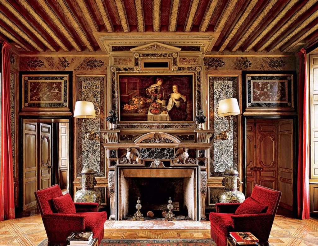
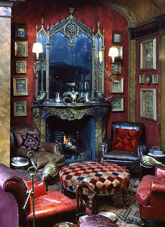
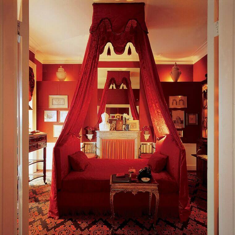
Decorator Renzo Mongiardino, one of my personal icons, was no stranger to red. Below, are a few of examples of his red interiors.

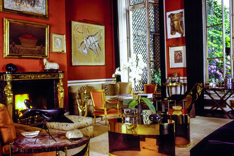
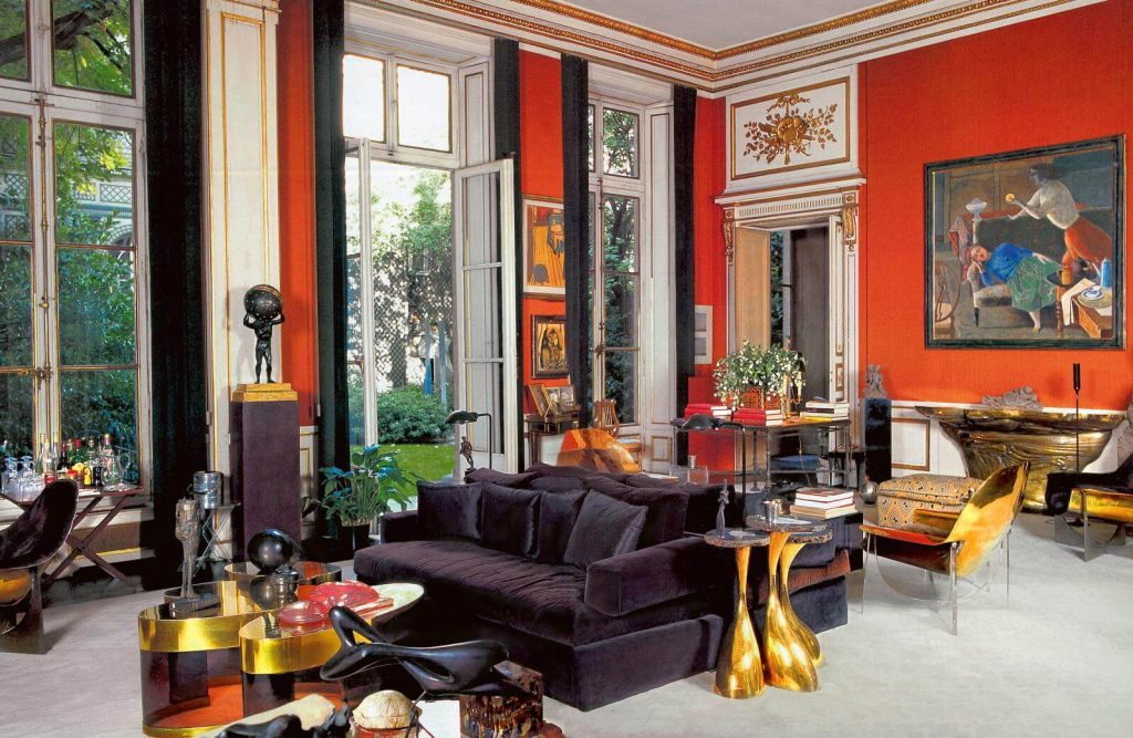
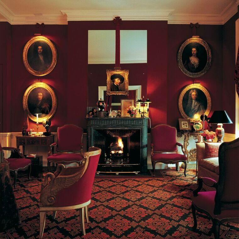
Another hero of mine, Henri Samuel, was likewise not afraid of red. The decorator to the Rothschilds used a striking vermilion in his own apartment below.
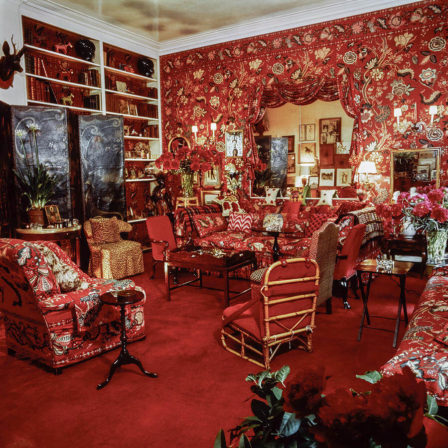
In 1955, Vogue editor Diana Vreeland hired society decorator Billy Baldwin to do her living room, requesting that it look like a “garden in hell.” Well, it certainly makes an impression…
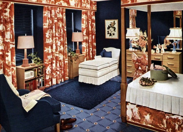
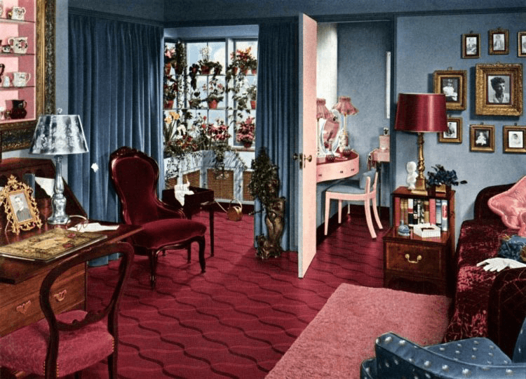
Of course, one need not go all out with red. Using it as an accent is quite pleasing, as well. For example, the two 1940s rooms below.
One decorator who used red with fetching results is David Hicks. His decorating acumen allowed him to mix swinging 60’s modernism with more traditional elements with aplomb.
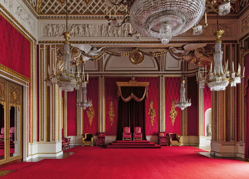
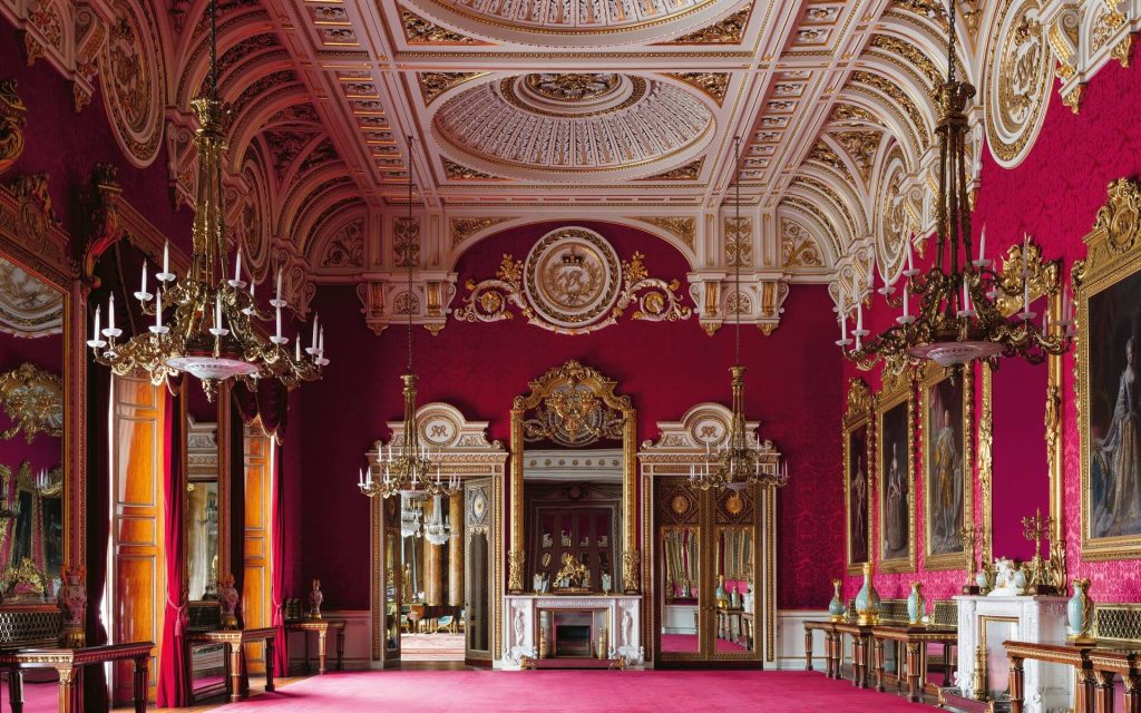
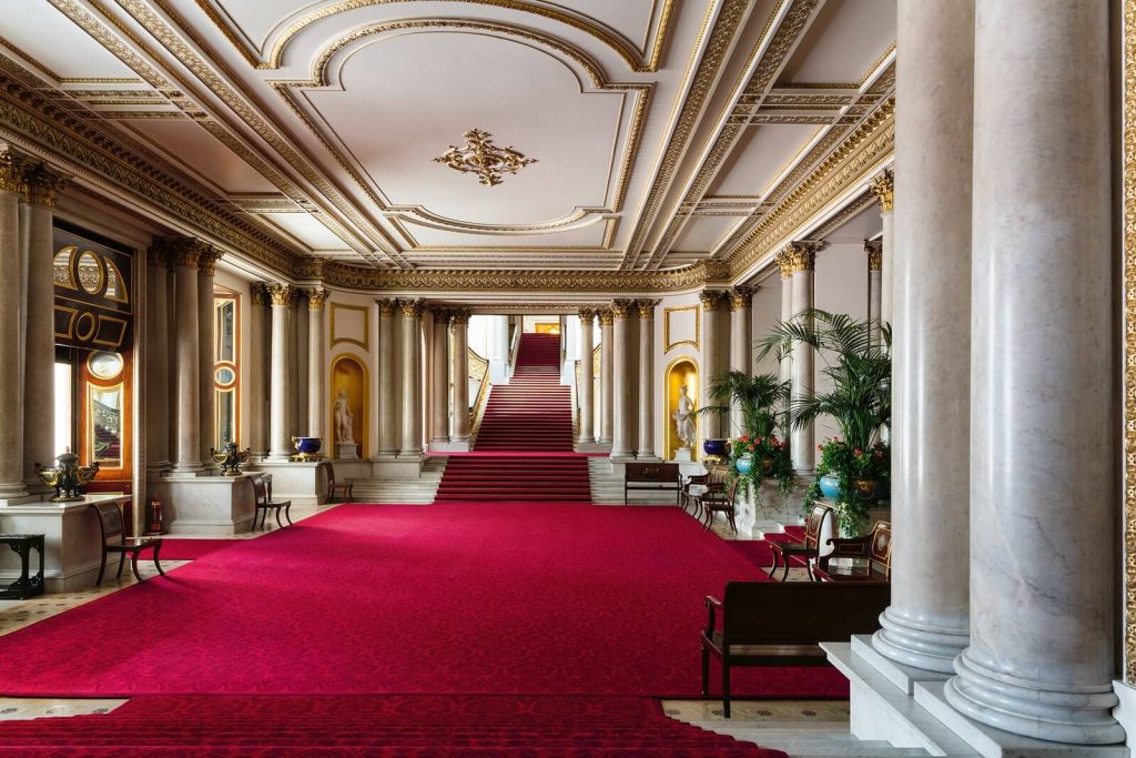
Speaking of Hicks, his son Ashley would later be given free reign (get it?) to photograph Buckingham Palace. The photos were published as a Rizzoli book in 2018. The broad use of red at the palace is an example of the stately projection of power, as opposed to romance. For those privileged enough to have taken a tour of the state rooms, you know that photography is not allowed. However, Hicks’ photos are better than what most of us could take anyway on a crowded tour, and I highly encourage you to buy the book!
As we see, red is a very assertive color. It’s certainly not for the timid. But for those who wish to have more commanding interiors with a strong point of view, you can’t go wrong with red! It’s always been my personal favorite color, and I would love to help you deploy it in your own home!