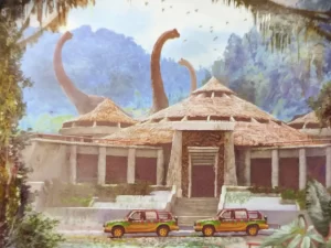
In both movie set design and interior design, the storytelling plays a pivotal role. Interior designers craft spaces that reflect the personality, preferences, and stories of their clients, while movie set designers translate scripts into tangible environments that enhance the narrative being portrayed on the silver screen. By effectively utilizing design elements, both movie set designers and interior designers harness the power of storytelling to captivate and transport their audience into a different world, be it fictional or personal.
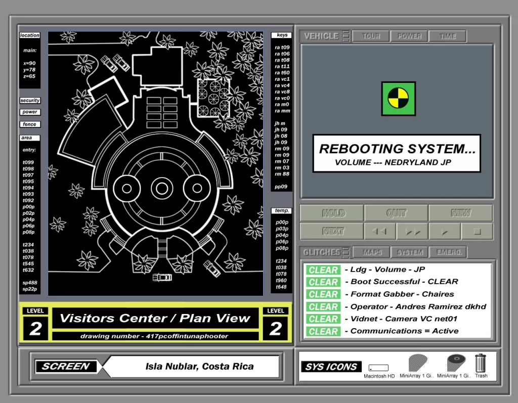
The set design for the landmark film Jurassic Park has received little mention in discussions of the film, which is a shame since it adds so much to the world-building. As we conclude this “Jurassic June” on the 30th anniversary of the release of Jurassic Park to cinemas in 1993, I thought we could take one last look at the film’s set design in this third and final installment of the Design of the Jurassic Park Visitor Center series. Be sure to check out the first post here, and the second post here.
Before proceeding, a disclaimer: Be advised that this blog post includes images of copyrighted material for the purposes of providing commentary and criticism on a small portion of a larger work. As such, this post constitutes a transformative work protected under fair use doctrine as stated in Title 17, Chapter 1, Section 107 of the United States Code as implemented by Congress beginning with the Copyright Act of 1976.
Now, let’s walk upstairs to discover the design deep in the heart of the Visitor Center’s core!

Heart of Darkness
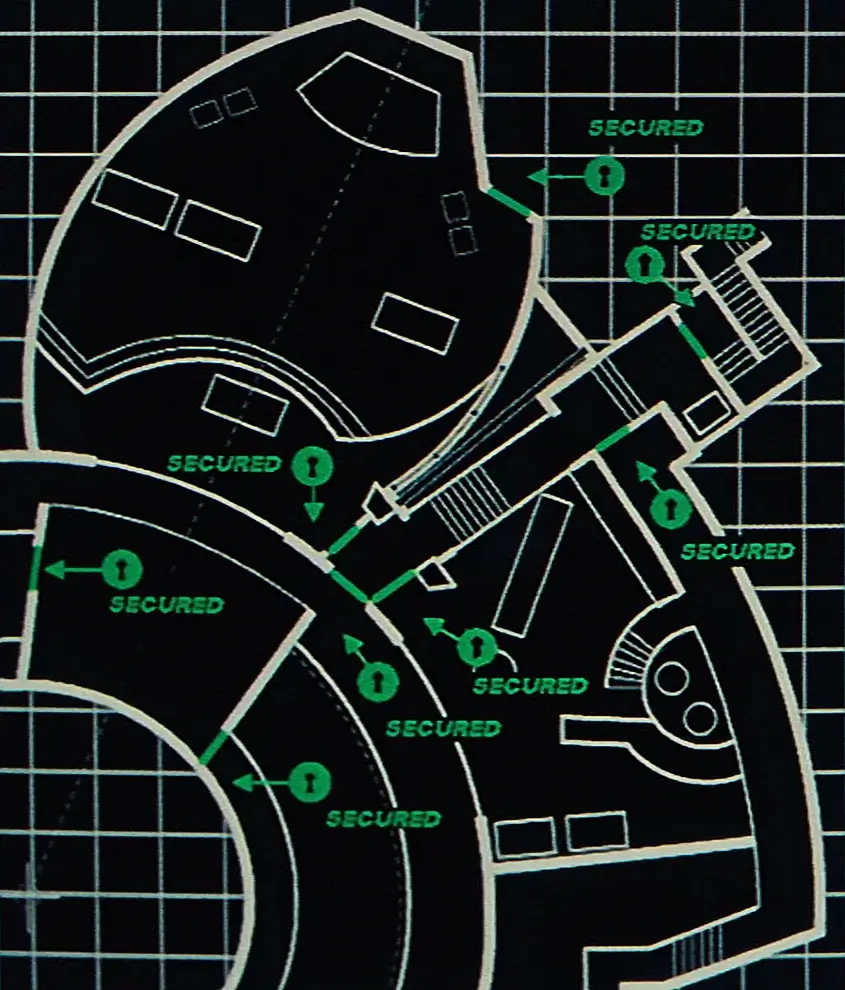
In stark contrast to the open loftiness of the rotunda and the inviting atmosphere of the park’s other main areas, the heart of the Visitor Center exudes a recognizable difference in tone. Here, darkness prevails as a visual manifestation of the serious subtextual themes of technology, control, and human dominion over nature which underlie the story of Jurassic Park.
Despite being on the second floor, we notice this section of the building gives a distinct impression of fortification—like being in a bunker. Notably, there are no windows looking outside. Instead, we find numerous interior windows serving as partitions between areas and fostering a myopic and self-referential atmosphere.
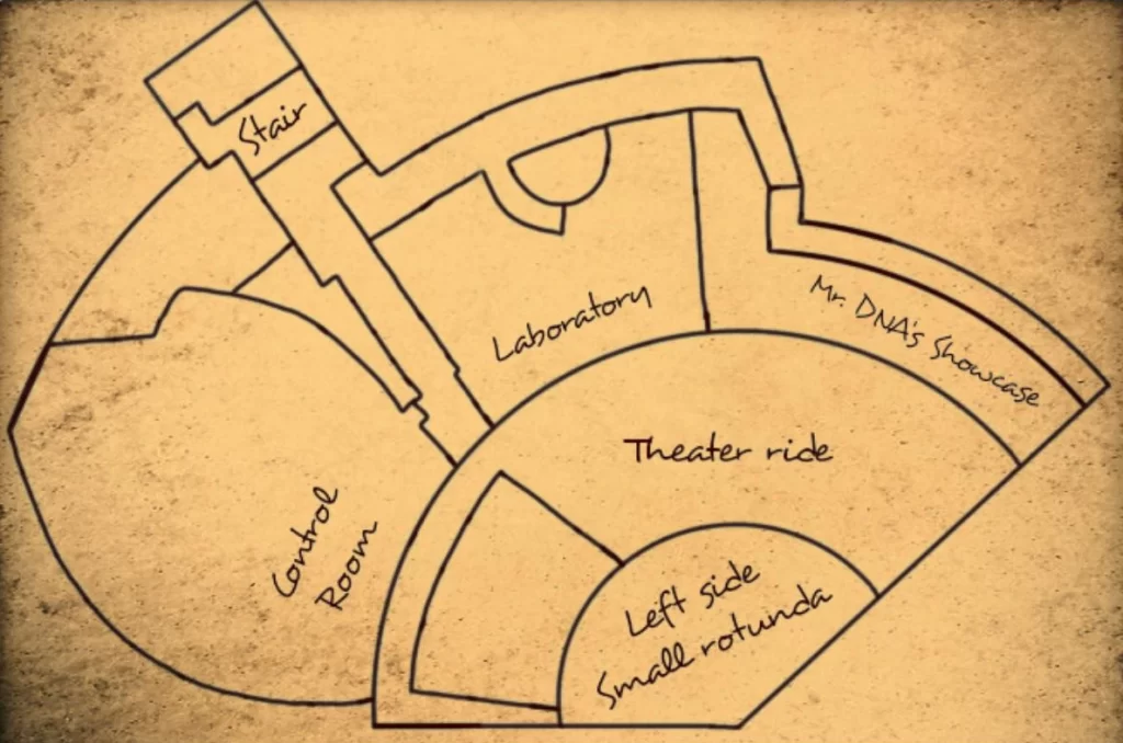
The absence of a connection to the outside world reinforces the idea that within these walls, the scientists and engineers of Jurassic Park have become masters of their own domain, exerting complete control over the dinosaurs they have brought back to life. The area’s myopic ambiance suggests a detachment from ethical considerations and consequences, as the focus remains fixated on the park’s internal operations rather than what’s occurring outside.
However, we must remember that this area is meant to be showcased to the anticipated tourists who are expected to eventually pass through the Visitor Center doors. The appearance of the operations center of Jurassic Park is meant to reassure tourists that everything is safe and under control.
Theater
The first room we see of the heart of the Visitor Center is the theater. Here, guests filter into a small space with stadium seating which looks onto a screen where they watch a film introducing them to Mr. DNA, an anthropomorphic Ed cartoon DNA strand who explains the technological miracles of Jurassic Park.
The red carpeting and maroon seats remind us that this is a theater space—red upholstery in theaters likely hailing from the heyday of the opera house. Additionally, red is thought to create a sense of darkness and immersion by reducing visual distractions and reflected light, drawing the viewer’s focus to the screen.
Theaters and screening rooms are very common elements of theme park and institutional experiences, as films provide easy and entertaining exposition. For example, I just paid a visit to the Bradford Island Visitor Center at the Bonneville Dam on the Columbia Rive which had a theater as part of its own tour experience.
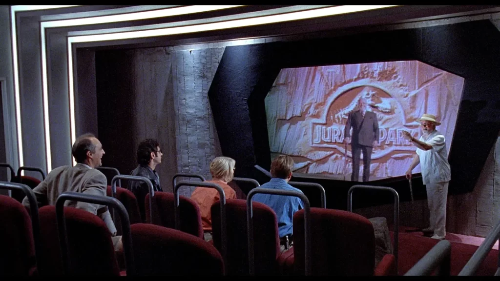
Despite its small size, the theater room at Jurassic Park has a cavernous quality. The room is done up mostly in greys. There is a lighted, stepped casing in the center of the room which brings focus to the screen at the front.
The screen is behind an asymmetric window, which recalls the postmodern design of the building. The angular shape of the window also evokes the planar surfaces of rocks. The window is framed by a stone trim (granite, perhaps?).
The wall surrounding the screen is covered in what appears to be stone tile. Stacked stone veneers were very popular in the middle of the 20th century—the heyday of what we now call “Midcentury Modern.” Orienting the veneers vertically would be a playful way of incorporating this design element at Jurassic Park with postmodern panache. Yet, the more likely material here is cast concrete and we will see ahead why I believe this is the case.
The Tour Moves On
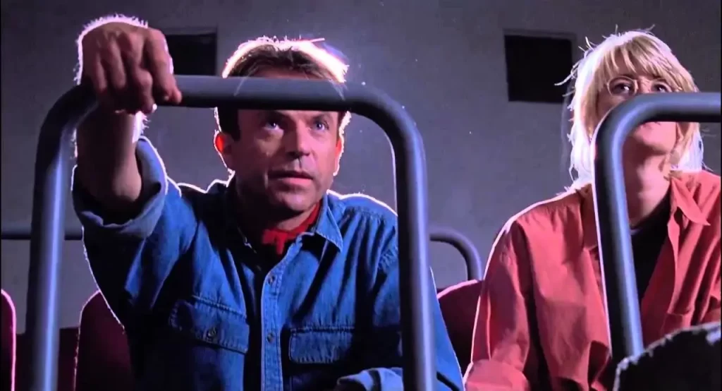
Upon completion of the short film, slate-blue restraint bars are activated to secure passengers in their seats as the room starts to rotate. We learn that the amphitheater is actually something of a theme park ride, and the room begins to move in a counter-clockwise arc on an unseen track.
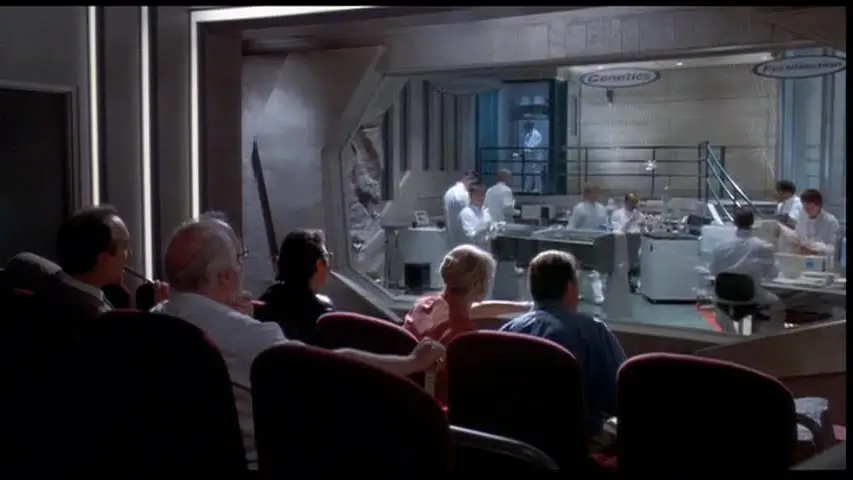
As the room turns, the screen wall transitions to a larger (but still asymmetrically-shaped) window with decals adhered to the glass saying things like “hatchery,” “genetics,” and “fertilization.” The window peers into a large room where we see computer stations, scientific equipment, and workers in white hazmat suits milling about. This next room is the laboratory showcase.
“Can’t We See The Unfertilized Eggs?”
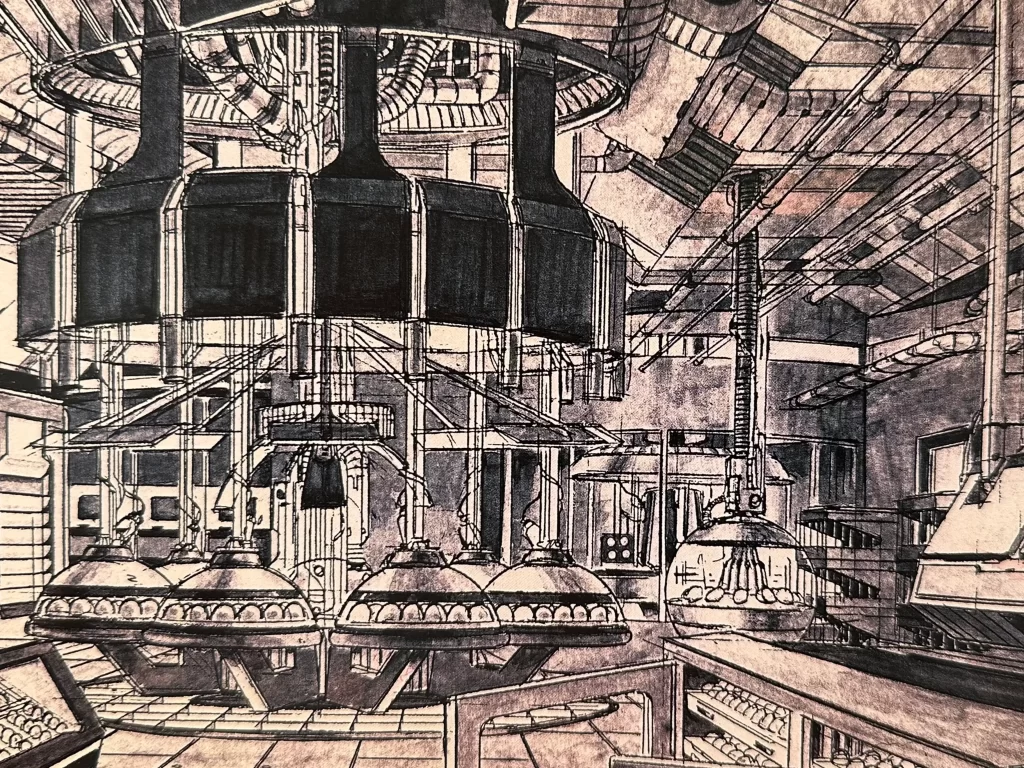
The laboratory, enclosed by concrete walls, is a clean and modern space with an overall industrial appearance. As someone who has worked in labs in a former life, I can tell you that the lab at Jurassic Park looks especially tidy and organized. Not surprising, given that it’s meant to be a showcase room.
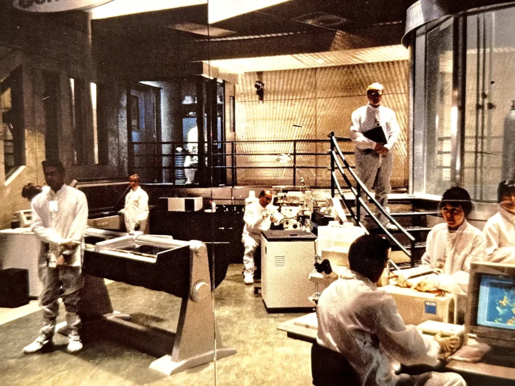
It appears that some of the walls are made of board-formed concrete, which I believe is actually also the case for the theater wall that I mentioned earlier. We can observe the same board-formed concrete on the wall where the lab picture window is located.

The floor is divided in two by a bright red stripe, one side of the floor being green and the other white. The floor materials are unclear. Terrazzo, perhaps, or some kind of vinyl tile?
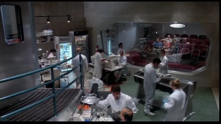
The lab is accessed through a “decontamination” vestibule on a mezzanine level and catwalk at the back wall. This vestibule is presumably where the park workers suit up before entering. The catwalk leads to an elevated cylindrical room with glass curtain walls which juts out into the lab, which is the embryo cold storage room. The whole layout is in effect echoing what was done in the Visitor Center rotunda.
The guardrails on the mezzanine are painted in the same teal color as the window muntins on the exterior of the Visitor Center. The mezzanine and catwalk floors are industrial metal grating. A short staircase leads down from the mezzanine to the lab floor below.
The floor plan is arranged such that the work of the scientists is front and center as viewed from the rotating amphitheater. On stage left, a pair of rectangular refrigerators occupy a corner, and behind we find a small area for the hatchery. There appears to be only one singular tub-shaped incubator whose basin is filled with Spanish moss and ferns over which lay a number of dinosaur eggs. The eggs are periodically turned by a robotic arm, which was inspired by machinery at the Jet Propulsion Laboratory at Caltech in Pasadena. A glass dome with heat lamp hangs over the incubator and can be lowered or lifted hydraulically.
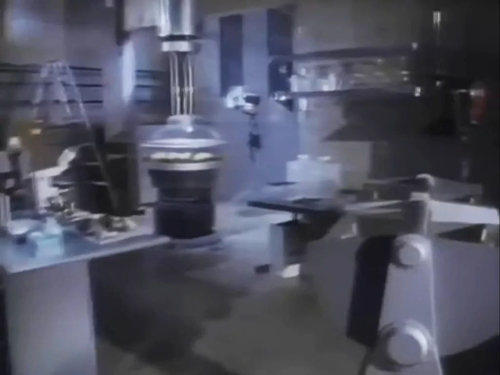
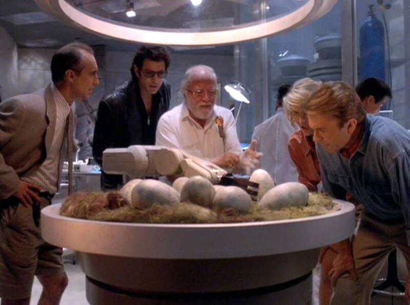
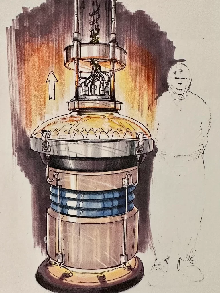
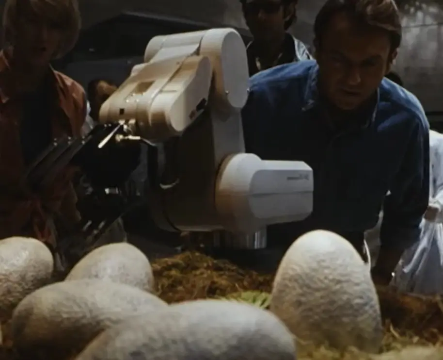

As the amphitheater continues to turn, we pass a doorway which leads to a corridor that separates the laboratory from the next space, the control room.
Control
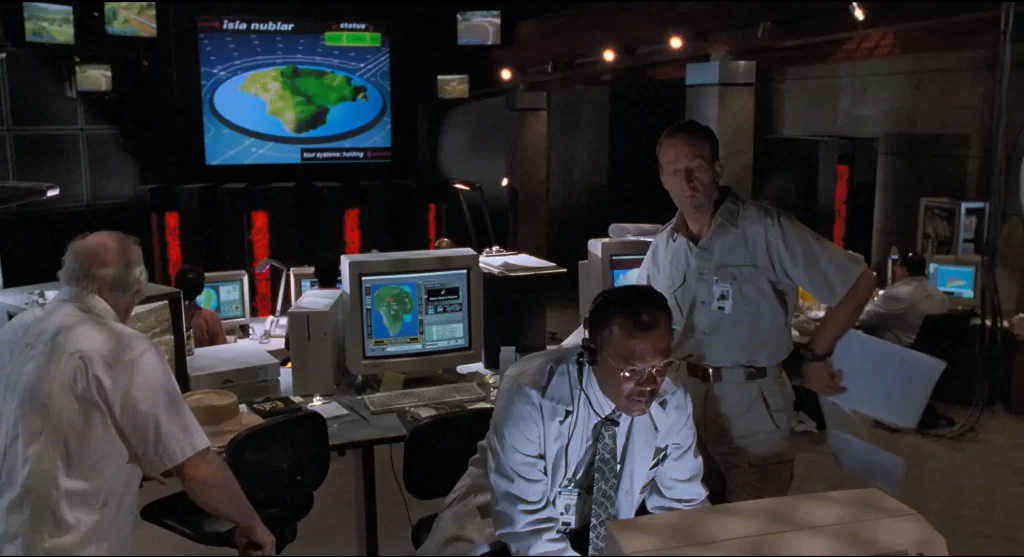
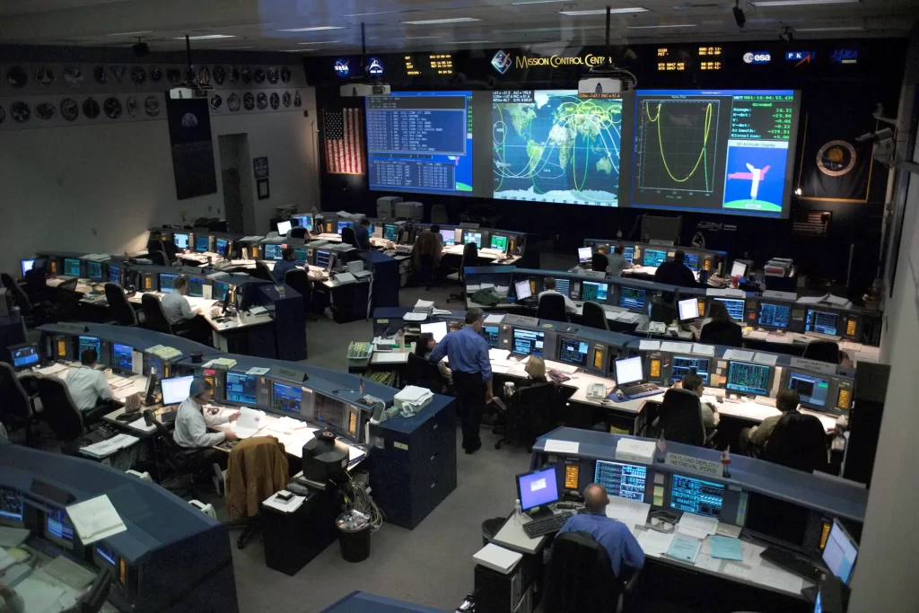
The control room at the Visitor Center is Jurassic Park’s operations hub. Think of it like NASA’s Mission Control center. All of Jurassic Park’s systems are designed to be operated from this room—even with minimal staffing for up to 3 days! (The latter proves to be a key plot point in the story.)
The design of the room was inspired by computer facilities at MIT and Caltech, as well as the set of the 1979 nuclear disaster film “The China Syndrome.”
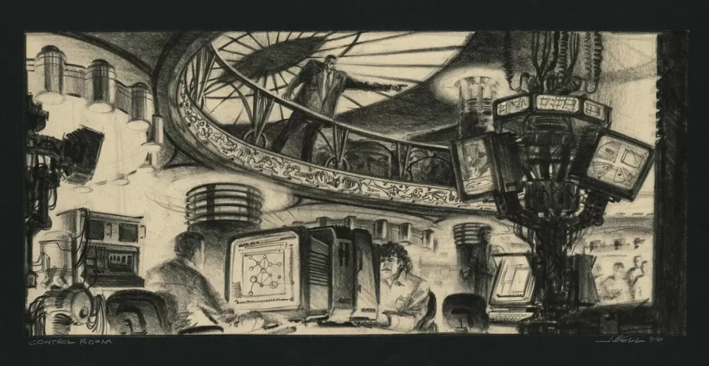
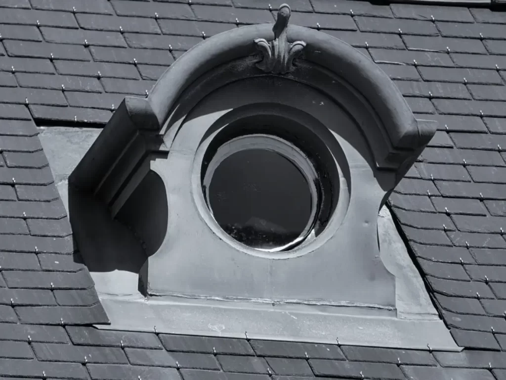
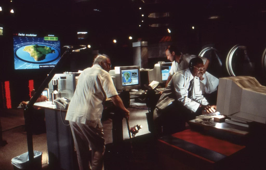
When we first see the room, we are immediately struck by its darkness. The whole room is bathed in black, with electronic screens and lights providing only minimal illumination. The only windows are found on a wall at stage left, and the windows face into the interior corridor which separates the control room from the laboratory. These windows are interesting, because they have the appearance of French dormer windows that have been rendered flat with the pediment tilted off axis. This is a prime example of a postmodern design referencing previous architectural traditions in a playful way.
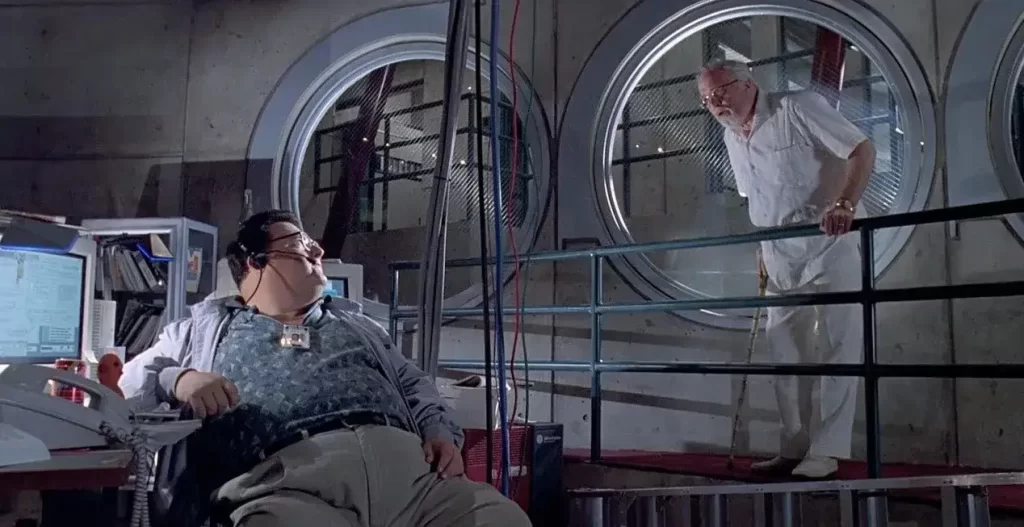
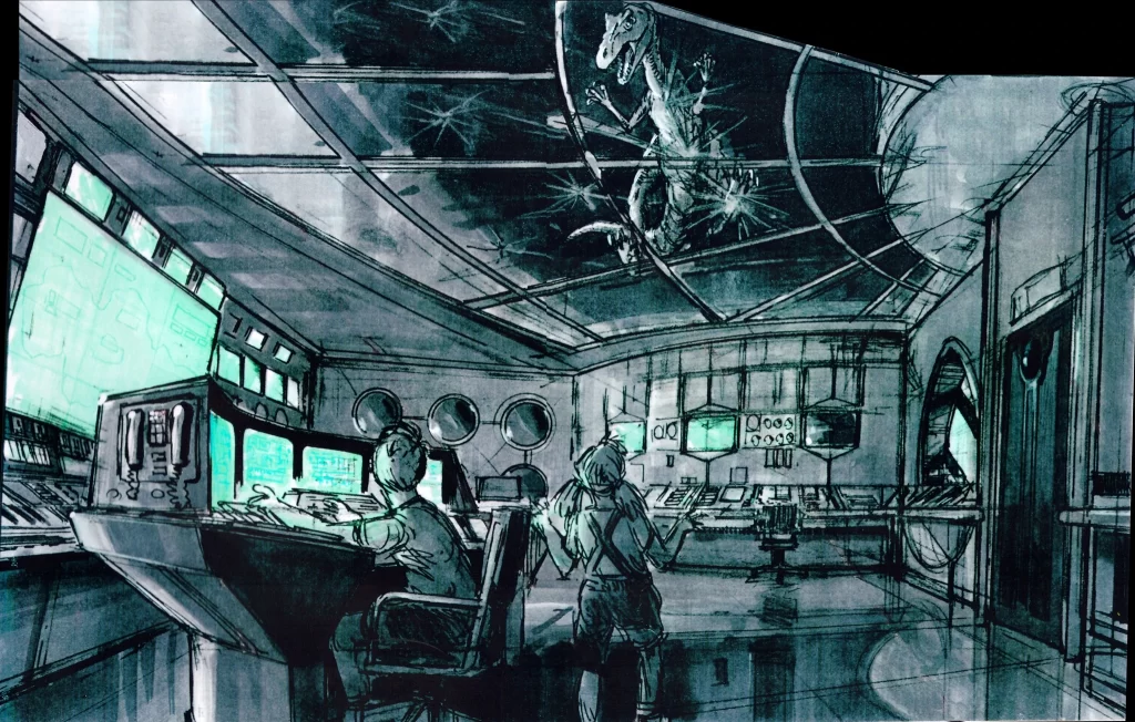
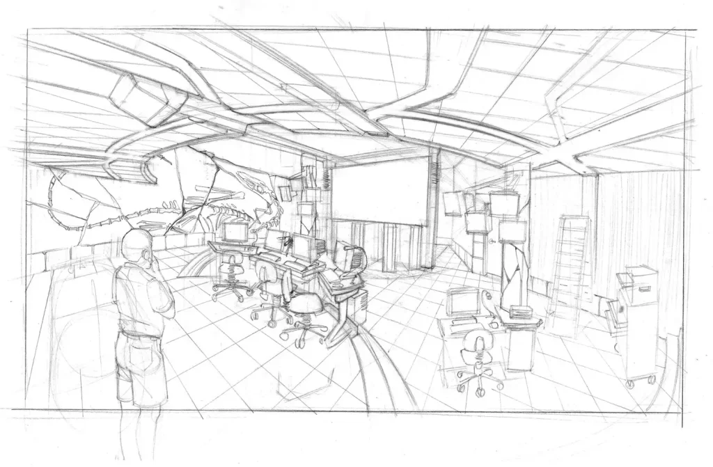
The back of the room is dominated by a large screen which features a map of the island rendered in 3-D. A few smaller screen flank this larger screen. This is a very common setup in these types of rooms, as we can see from the NASA Mission Control center.
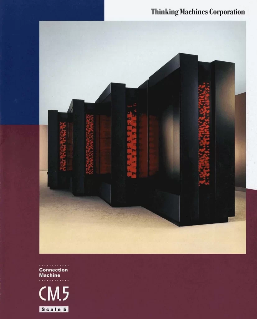
Below the screens is a bank of black structures which feature blinking red electronic lights in a sort of hatched pattern. They are actually computers—supercomputers, in fact! These are Connection Machine supercomputers from the now defunct Thinking Machines Corporation. When the film was released in 1993, Thinking Machines laid claim to the four fastest computers in the world! Clearly, Hammond spared no expense!
“Alejandro’s Prepared A Delightful Meal”
Elsewhere in the Visitor Center, John Hammond entertains his guests over a luncheon of Chilean sea bass in the conference room of the Visitor Center while slide projectors display Jurassic Park marketing images in the round.
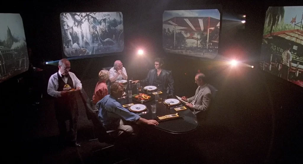
The simplicity of the room’s design is interesting. This scene, arguably the most important in the film, exposes Michael Crichton’s philosophical underpinnings and moral concerns regarding Jurassic Park as a story, and the dangers of technological hubris writ large. Therefore, it is crucial that the scenery not distract or diminish the gravity of the ideas expressed through the characters’ dialogues.
Art Director Patty Podesta set up this room with the assistance of Art Department Coordinator Caroline Quinn, who organized and produced many of the slides. The slides aim to depict a forward-thinking optimism regarding the park’s expected profitability and upcoming attractions, juxtaposed with the scientists at the table who raise more serious inquiries. The projectors cast a halo effect behind the actors’ heads, creating a poignant piece of cinematography.
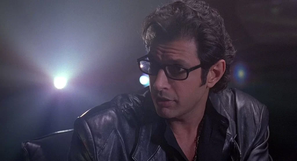
In terms of interior design, the room maintains a deliberate simplicity that aligns with its function as a conference room for discussing important ideas. It features a glossy black oval table, complemented by sleek, modern leather chairs. The walls are completely covered in pitch black duvetyne, ensuring the absence of any external light intrusion. That lunch is served in the conference room as opposed to the Cretaceous Cafe underscores the importance of both the people present in the room and their conversation.
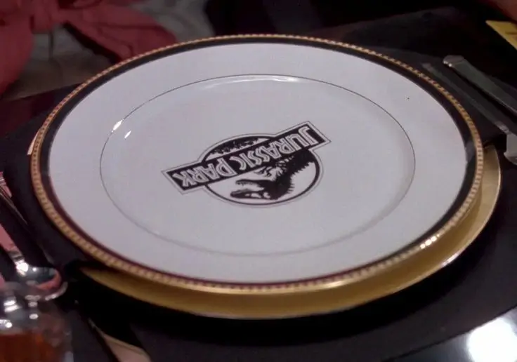
Speaking of lunch, we witness the placement of exquisite “Jurassic Park”-branded chinaware on the table. The plates are of the “Black Band” pattern by Tiffany and Co. and were crafted in Limoges, France. They boast a burnished gold outer band adorned with glossy dots, followed by a black band. Specifically for the film, a “Jurassic Park” logo appears to have been meticulously applied in black enamel overglaze. The style closely resembles the more popular “Blue Band” pattern that once graced numerous wedding registries. Unfortunately, both patterns have been discontinued for quite some time, although they occasionally surface on the secondary market.


30 Years of Inspiration
Much like interior design does for real-life spaces, movie set design intertwines story-telling and aesthetics to create unique environments that shape our viewing experience. The often-overlooked set design of Jurassic Park demonstrates the vital role it plays in constructing a compelling and immersive world that resonates with viewers even after 30 years, serving as a visual testament to the enduring themes and intentions behind the story. The set pieces of Jurassic Park are as much a part of the film as the action sequences, dialogue, and score!
Thank you for joining me on my three-part tour of the iconic Jurassic Park Visitor Center’s design. The film and its visuals have captivated audiences worldwide for the past 30 years thanks to the brilliant direction of Steven Spielberg and the collective efforts of the entire production team. They successfully crafted a mesmerizing world that still feels incredibly tangible–almost within our reach. Here’s to 30 years more of dino-mite success for one of the greatest summer blockbusters of all time!
