
Ah, interior paint. Just thinking about it, can you feel your blood pressure rising?
When it comes to interiors, paint is probably the one thing I find many home owners fret over the most. I’m not sure why, exactly. There seems to be an overwhelming fear of choosing the “wrong” color, and this can prevent people from moving forward with anything else (If only people would be as trepidatious about choosing their furniture…). Anyway, I want to stress that choosing a color is not the first thing you need to think about when painting, so please don’t get too hung up on it.

Some interior designers have been taught that the paint color should be the LAST selection that is made for a design. I do not agree, as I believe there is no hard and fast rule. Sometimes, a design is inspired by a beautiful color, and so that color is the starting point around which the rest of the design coalesces. In such cases, maybe the color could be used to paint the walls, but it can also be incorporated into accents. It really just depends on what you want and the look you are going for.
But before I would even think about a design for a room, I have to gather baseline information that will inform the direction the design should go. This is very important, because a room does not exist in a vacuum with perfect lighting evenly distributed across all walls.

In fact, lighting is the single most important factor to consider when choosing your paint color! Why? Well, the fact is that the amount and source of light you get in a room will impact how you perceive color.
If your room faces south, and you have large southerly-facing windows, you will be receiving a lot of natural light throughout the day in varying intensities, but particularly at mid-day. A room with northerly-facing windows will have more even light, but it will never be particularly strong and will always have a greenish cast.
A room with windows facing east will obviously get good morning light, while westward-facing windows will get strong, sometimes very intense afternoon light. Your latitude will also impact how much light you receive during the seasons, and don’t forget local climate considerations. Here in Seattle, we tend to get a lot of overcast days. Let’s also not forget that windows are apertures and their sizes determine the amount of light that will stream into a room, as well.
Okay, so what does lighting have to do with color?
Well, you should understand that color perception is directly related to light. This is because visible light is electromagnetic radiation limited to specific wavelengths on the electromagnetic spectrum. When we see the color of an object, it is because the object is reflecting a particular wavelength that our eyes and brain then interpret as a specific color. Thus, how your eyes perceive a color will change depending on the availability, time of day, source (artificial versus natural), and season of light! Even within a room, light is not distributed evenly. In the typical rectilinear room, darkness tends to pool in the corners (this is why decorators recommend illuminating corners with lamps).
Instead of worrying about particular hues, tones, tints, or shades, it’s more important to consider the function of a room, the time(s) of day it will be used, and the holistic design. For example, a room that will be used only in the evening should be painted in a color that will look good under artificial light. For a bedroom, you may want to choose a calming color as opposed to a strong, intense color that will have your photoreceptors firing when you’re trying to relax and go to bed.
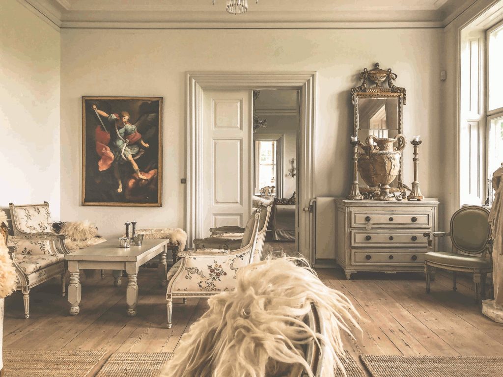
As for the function of a room, this should be an important consideration for paint finish. Working rooms which are exposed to high levels of moisture and mess—like bathrooms, kitchens, and laundry rooms—should be painted with a finish that is easy to clean and provides moisture resistance. Satin, Eggshell, and Semi-Gloss finishes are perfect for these cases. More formal rooms, like living and dining rooms, do well in Flat or Matte finishes in households without young children, especially if you are wanting to de-emphasize any wall texture.
Then, there is the question of formulation. Admittedly, I have never been keen on painting my own walls, and in the few times I have tried, ended up hiring someone else to finish the job. For me, the prep-work and stress is not worth the effort, and I would prefer to leave that to the professionals. Your painters can advise you on the formulation they will use, but be sure to specify any requirements you may have like low-VOC paint. That being said, Benjamin Moore’s Aura and Sherwin Williams’ Emerald are popular choices. Farrow and Ball make it easier, but may not be as available and your painters may have not worked with it before.
In any case, choosing paint for your interior shouldn’t be so complicated that it paralyzes you. At the end of the day, it’s just paint, and can be painted over if it doesn’t suit your taste, after all. Choose a color that you love, fits your room design, and looks best at the time of day and under the kind of light available when you are most using the room.