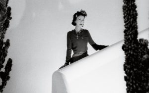
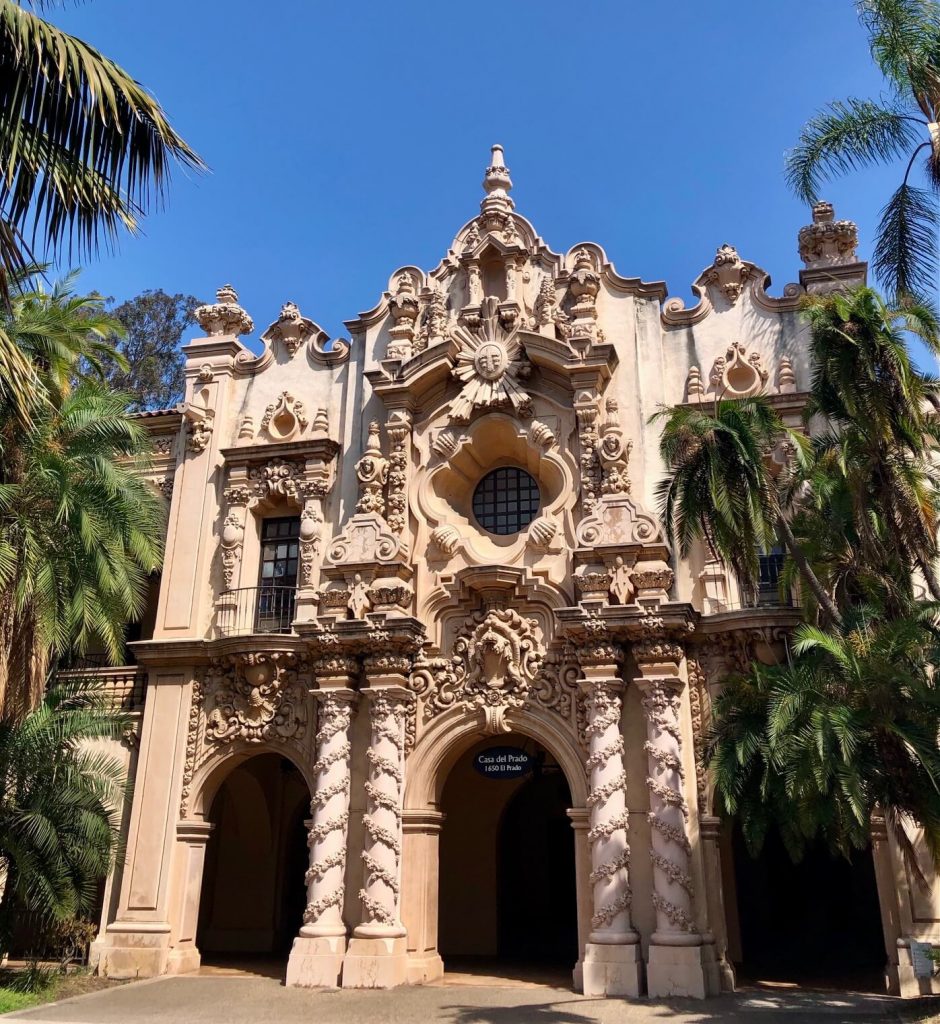
I had the pleasure of visiting San Diego earlier this month (“America’s Finest City,” as it calls itself) and was struck by the prevalence of a particular motif on many residential buildings: the barbed quatrefoil.
The quatrefoil itself has a long history in design, and was particularly common in Gothic art and architecture. However, the ornamental reference in San Diego was not Gothic, but rather to the oculus windows adorning the Casa Del Prado building complex in Balboa Park. These buildings are among many that were originally built for the Panama-California Exposition which opened in 1915, celebrating the opening of the Panama Canal.
Along the West Coast, such expositions have left an architectural mark on their respective civic fabrics in one way or another. In San Francisco, the Palace of Fine Arts is a paean to the classical architecture of Ancient Rome. Here in Seattle, the Alaska-Yukon-Pacific Exhibition left scant architectural relics but did form the planning framework for the University of Washington as it sits today, with its glorious Rainier Vista!
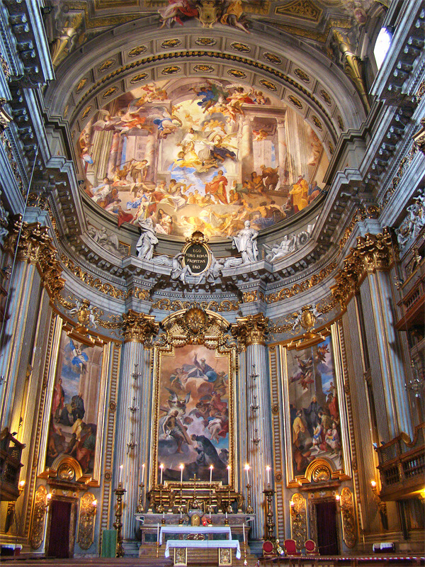
In San Diego, however, the legacy of the Panama-California exposition was more than a few tokens. It’s campus and buildings continue to serve as a cultural heart for the city, owing largely to the Exposition’s defining architectural style: Spanish Baroque.
At a time when much of the public architecture in the United States was being executed in the Beaux-Arts style, the choice of a dramatic Spanish Baroque design—with its Churrigueresque ornaments copied from Spanish and Colonial Mexican churches— left an indelible impression on San Diegans (So much so, in fact, that it gave rise to the vernacular architecture we have come to call Spanish Colonial Revival).
Now, Maison Dumar Interiors is not an architectural practice, but architecture and interiors have long been strongly correlated. Seeing the Casa Del Prado quatrefoil motif repeated on many houses had me wondering how a Baroque interior design could be implemented in a modern, relatable way without sacrificing fidelity to the Baroque’s aesthetic qualities.
What is Baroque?
While I have already touched on the moral dimensions of the latter day design debate between modernism and traditionalism, it’s important to understand that the amalgamation of morality and interior design is nothing new. It was especially prevalent in the 19th century, as capitalism gave rise to the (supposedly) insolent middle classes in the Industrial Age. Going back further, we find a time when art, architecture, and, yes, interior design took on decidedly pugilistic stances in response to a religious crisis that swept Europe after a man by the name of Martin Luther purportedly nailed some documents to the door of a German church.
Luther, of course, catalyzed the Protestant reformation that would spread across Europe and challenge the authority of the Catholic Church. Not to be outdone and undermined, the Catholic Church initiated its own comprehensive reforms in response. This “Counter-Reformation,” coupled with what today could be called a concerted Public Relations campaign in the arts and other cultural endeavors, produced the style that today we call Baroque.
The purpose of this Baroque style was to win over the hearts and minds of the church-going masses who may otherwise have been persuaded by the Protestant ethos—defined as it was by simplicity and asceticism. In contrast, the Catholic Church encouraged strong, captivating aesthetics that would connect emotionally and personally with the public. The dichotomy of 17th-century aesthetics, then, was distinguished between reticent Protestant minimalism and passionate Catholic maximalism.
Characteristics of Baroque Style
There are a number of characteristics that epitomize Baroque style, including:
- Deep, rich colors
- Contrast – The interplay of lightness and darkness is an important dramatic element of Baroque arts that provides focus and encourages emotional intimacy.
- High relief – As with contrast above, high relief gives strong definition to sculptural elements to emphasize light, shadow, proximity, and materialism.
- Dynamism – Movement and interaction are important elements. Baroque pieces are not static; action and reaction provoke empathy.
- Time – The dimension of time within Baroque pieces is short and instantaneous. In art, the subject matter is often captured within what appear to be milliseconds of some action, almost as if the viewer is capturing the subject off-guard.
How to Create a Baroque Interior
Historical Baroque interiors are beautiful and dramatic, but would be difficult to pull off with today’s more casual lifestyles. However, now that we know what Baroque is and the characteristics that define it, we can proceed with picking out decorative elements that could work for a Baroque interior design.
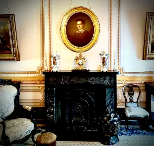
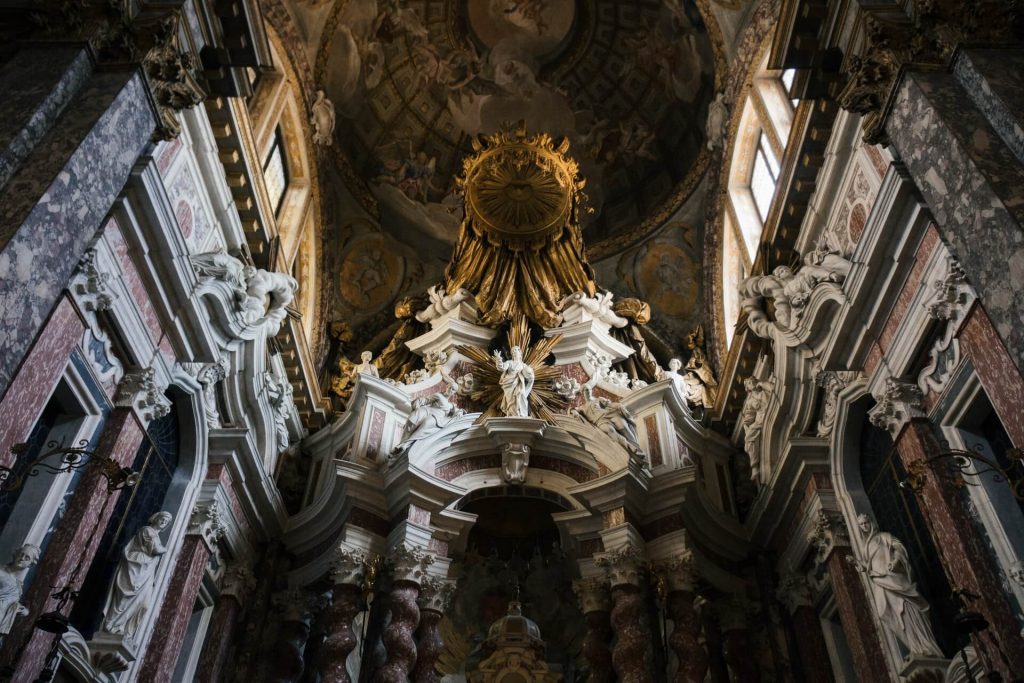
Let’s have a look at the photograph below I took in the lobby of the Hotel Fairmont San Francisco. Now, I am not sure who did this design, but I think it exemplifies many of the characteristics of Baroque style described above. Can you recognize them?
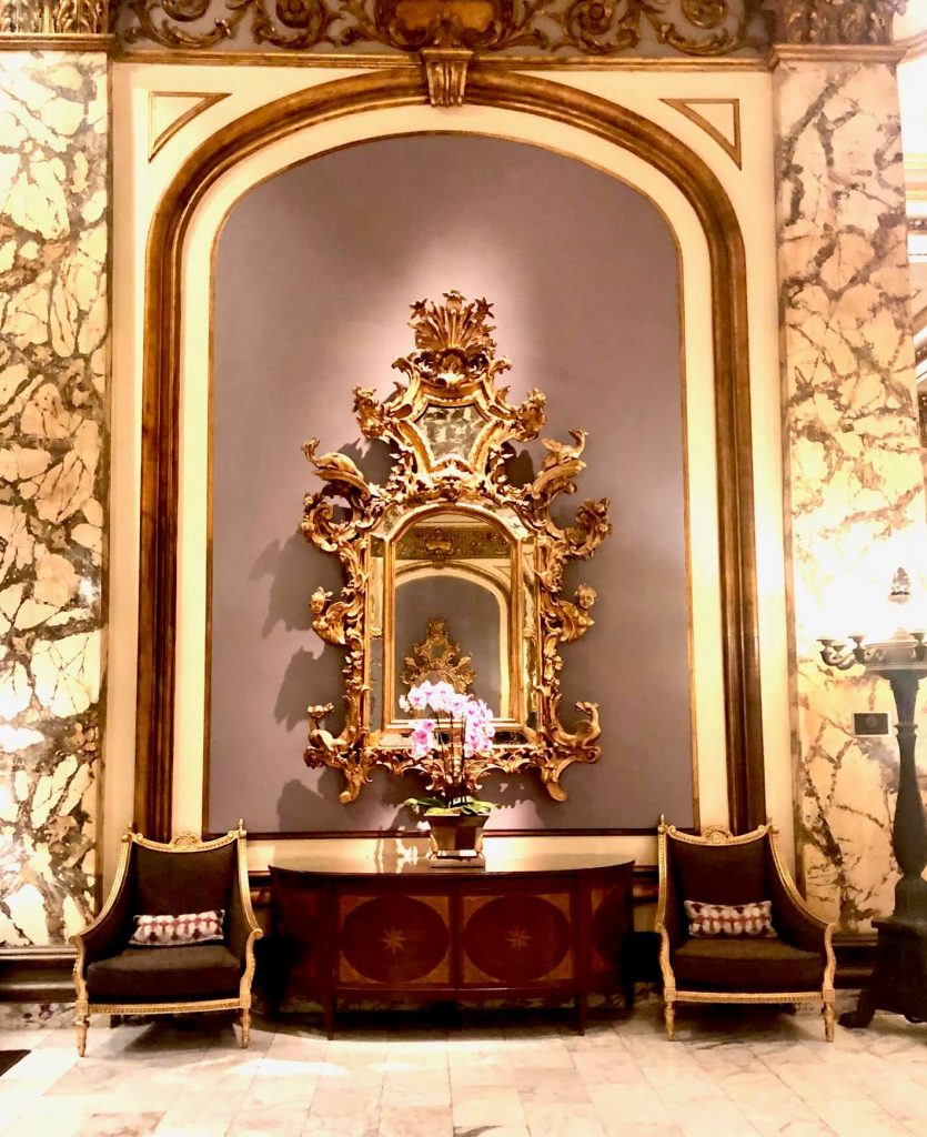
First, the mirror is very much in the Baroque style, with its dynamic, high-relief carving. We also see contrast in the variegation of the stone pilasters; the light color of the panel ground juxtaposed with the wood moldings; and the dark upholstered chairs. The colors are rich and warm.
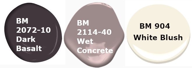
If I were to try and re-create something similar at home, I could start with similar colors. For example, the following colors from Benjamin Moore are close:
Next, notice how the wood elements are of a warm, medium tone. Now, the gilded chairs in the image above are of a neoclassical style, which came into fashion about 30-40 years after the Baroque period ended. Baroque furniture tends to be visually heavier, and might not work specifically in modern interiors. Using the color palette above, we could stick to warm wood furniture if we wish, but we could also choose a lighter wood (The latter would work best if we restrict Benjamin Moore’s “White Blush” to accent work).
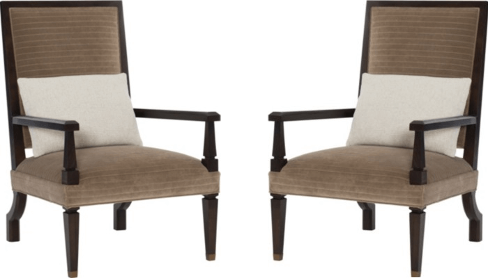
But let’s be a little more adventurous. I like these Cleft Foot Fauteuil chairs from Hickory Chair below. The fauteuil chair is actually a Baroque innovation from France. These chairs from Hickory keep the same general design, but add a contemporary flair, with their angular facets. The dark wood finish here actually works well with our color scheme (but I would opt to upholster them in a more contrasting color).
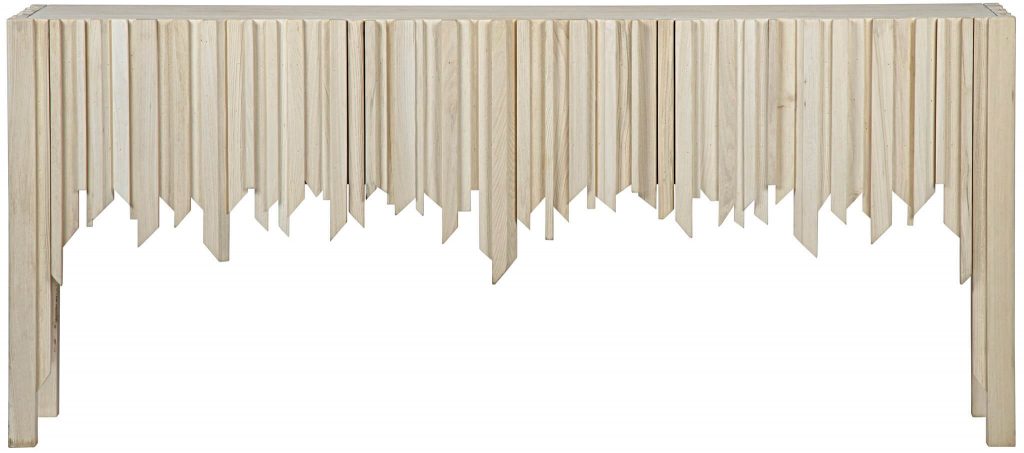
Since the finish on the chairs above is dark, let’s go with a lighter color for the console. This Desdemona sideboard from Noir Furniture echoes the angular shape of the chairs, and also incorporates the carved sunray shapes that are a common decorative motif of Baroque design:
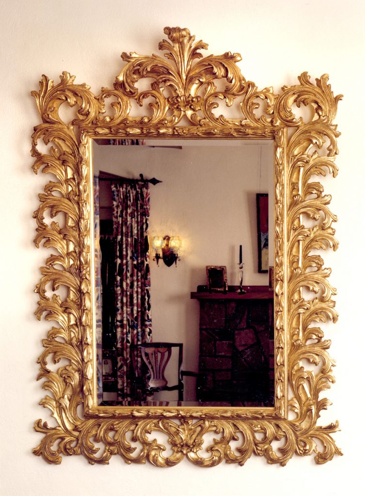
Finally, for the mirror, let’s go all-out Baroque with this larger piece from Carver’s Guild:
When we put it all together, and add a few accessories, we might get something like this:
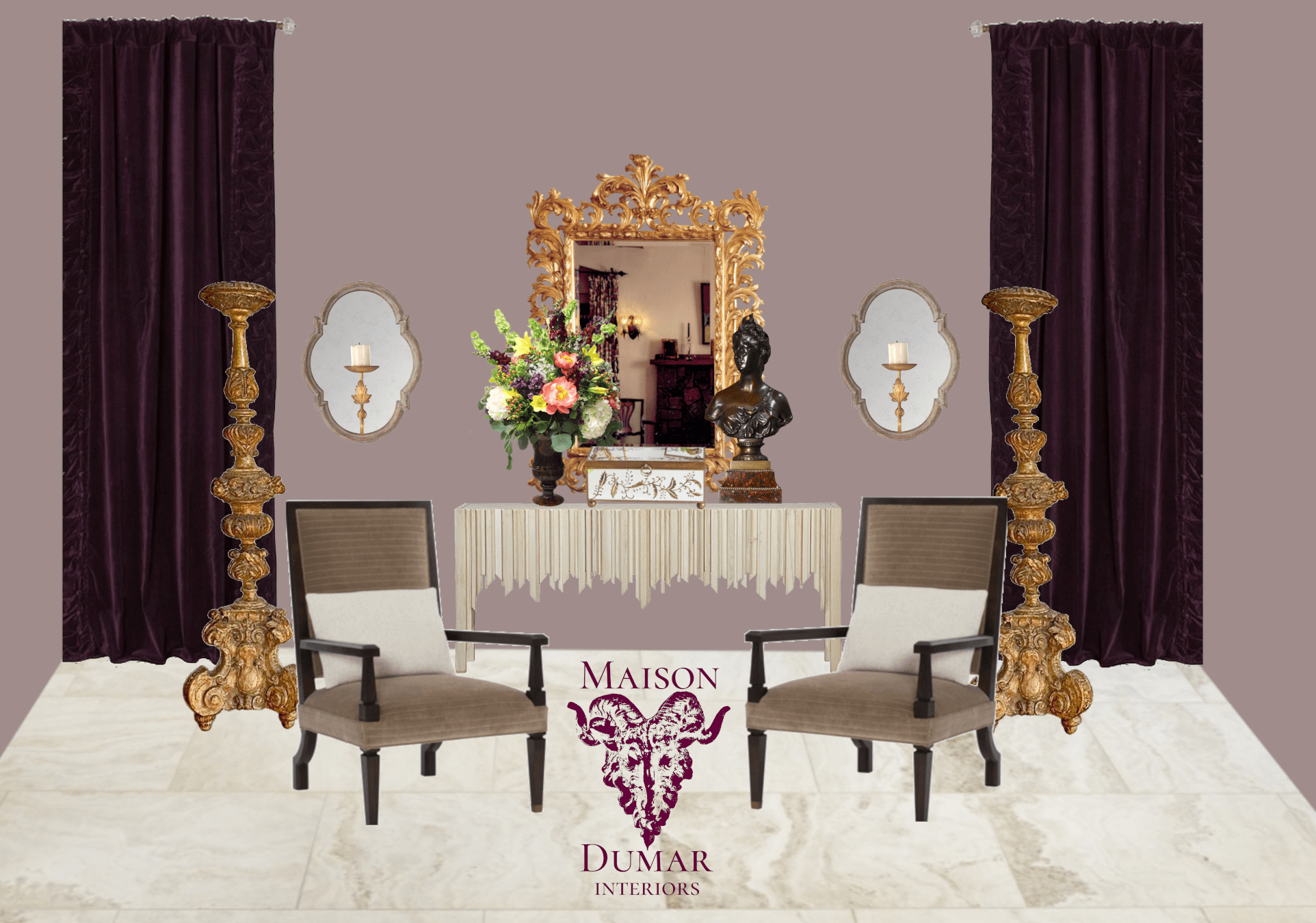
And there you have it! A contemporary interpretation of Baroque style.